Hello There!

Lorem ipsum dolor sit amet, consectetur adipiscing elit,

 About Mohammedimad

Mohammed Imad is a Universal Designer and NID alumnus, currently working as a CRO Specialist and UX Designer at Tatvic. He specializes in Product Design, UX Research, and User-Centered & Inclusive Design. His design process emphasizes creating thoughtful solutions that enhance user experiences. His interests include crafting, 3D modeling, cooking, and reciting poetry.

Strategies for improving the purchase funnel in e-commerce on mWeb

In the world of E-Commerce, Regulating the purchase funnel has become essential for improving conversions and sales. Here, We will explore certain strategies that can help to enhance each stage of the purchase funnel & help you create a seamless and compelling shopping experience for your customers. 

1. Navigation: 

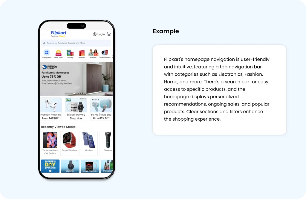
Enhance user experience by streamlining the website’s user journey for seamless navigation. Ensure the hamburger menu features intuitive options with appropriate icons, facilitating quick and user-friendly navigation. 

Always test your navigation with actual visitors and refine it based on their valuable feedback.
 

Source

2. Simplify Checkout Process:

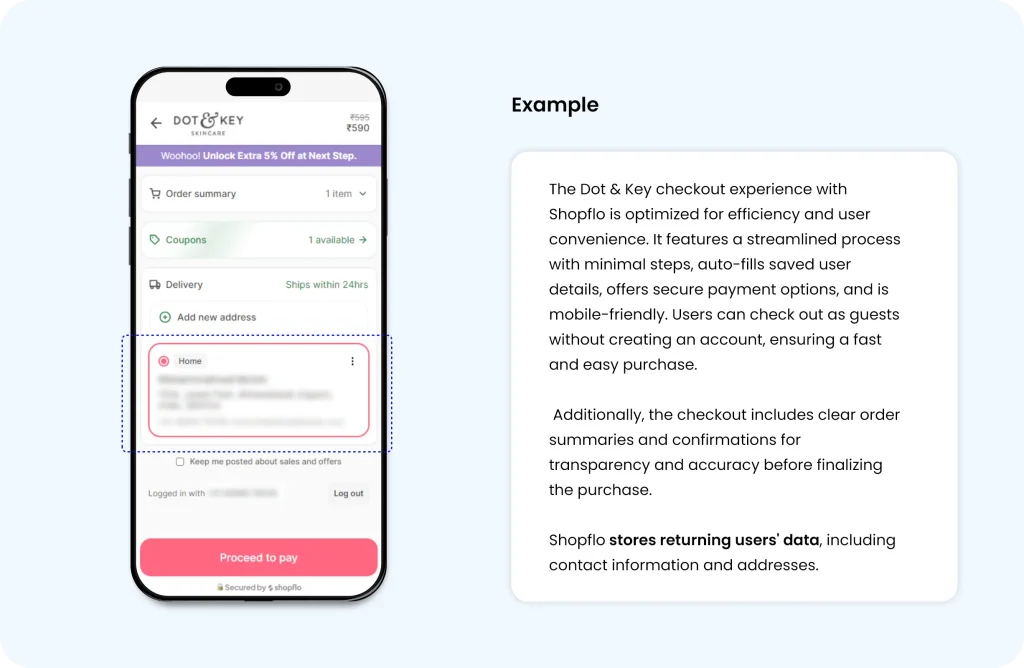
To improve conversion rates, streamline the checkout process by minimizing steps and reducing friction. Simplify the checkout by removing unnecessary fields and reducing the number of steps required. Implement features that remember returning users’ details, allowing them to quickly navigate to the final payment page.

Utilize plugins such as Shopify, Shopflo, WooCommerce, and MemberPress to save user details like name, address, and contact information, ensuring users don’t need to re-enter their information on subsequent visits.
 

Source

3. Enhance Product Descriptions: 

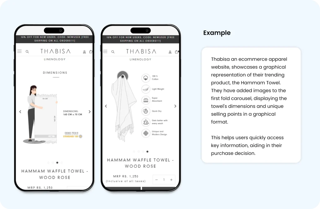
Deliver clear, compelling product information in an easy-to-digest format. Use graphical representations where possible, as they tend to be more persuasive than lengthy text. Keep textual information concise and complement it with relevant icons or images.
 

Source

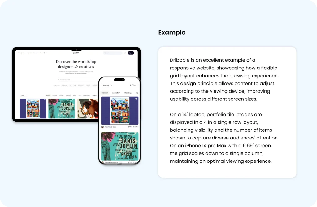
4. Implement Responsive Design:

Optimize your website for accessibility and user-friendliness across a range of devices, ensuring a seamless and engaging experience. By delivering a top-notch user experience, your site will facilitate quick and effortless navigation for all users. 

Incorporate key principles of UX design and Heuristics to craft a website experience that is not only seamless but also intuitive and satisfying for website audience. 
 

Source

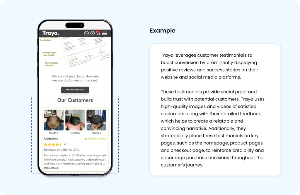
5. Leverage Social Proof: 

Enhance trust in your products by prominently displaying customer reviews and testimonials on your website and marketing materials. 

This strategy not only builds confidence among potential buyers but also demonstrates the real-world value and satisfaction experienced by existing customers.
 

Source

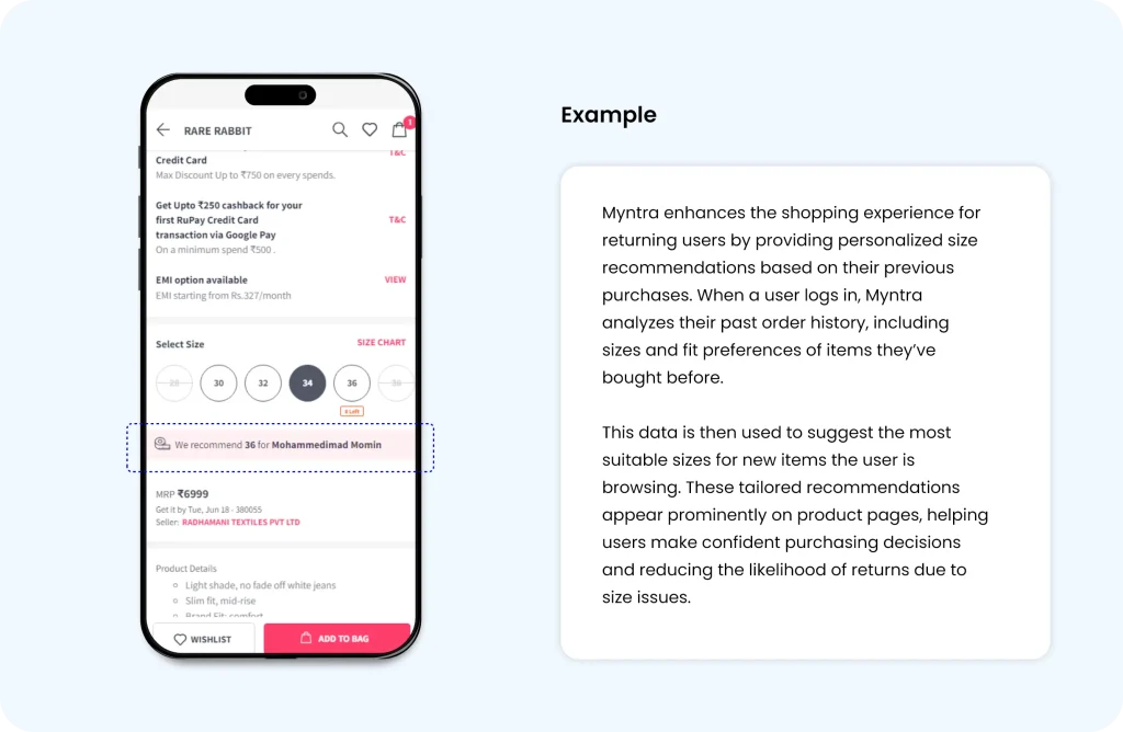
6. Personalize User Experience:

 Website personalization is about making custom experiences for each person who visits a website.

Instead of everyone seeing the same thing, companies can create special experiences that fit what each customer needs and likes. This makes customers more likely to enjoy their visit, stay longer, and come back again.
Source

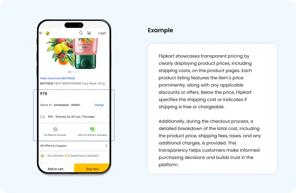
7. Provide Transparent Pricing: 

To enhance the purchase funnel in e-commerce, it is crucial to provide transparent pricing. Clearly display product prices, shipping costs, and any additional fees upfront to avoid any surprises at checkout. This transparency builds trust with customers, reduces cart abandonment rates, and improves the overall shopping experience, leading to higher conversion rates and increased customer satisfaction.
 

Source

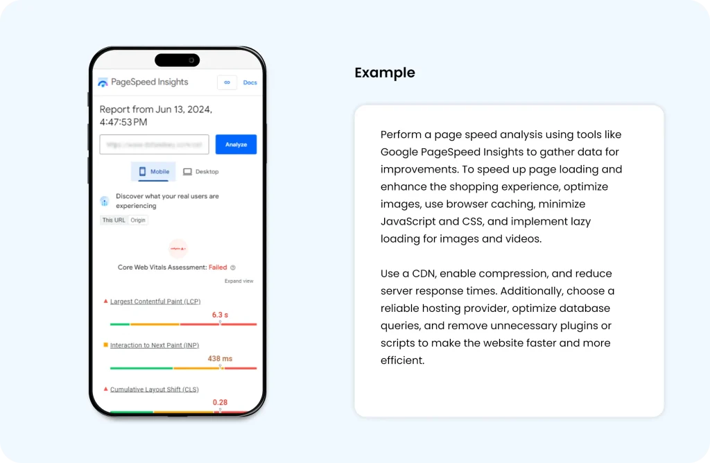
8. Optimize Page Load Speed:

Optimizing page load speed is crucial. By improving site performance, we can significantly reduce user frustration and decrease the likelihood of abandonment. 

Faster loading times lead to a smoother user experience, encouraging customers to stay on the site longer, engage more with products, and ultimately, complete their purchases. This optimization not only boosts customer satisfaction but also positively impacts conversion rates and overall sales.
 

Source

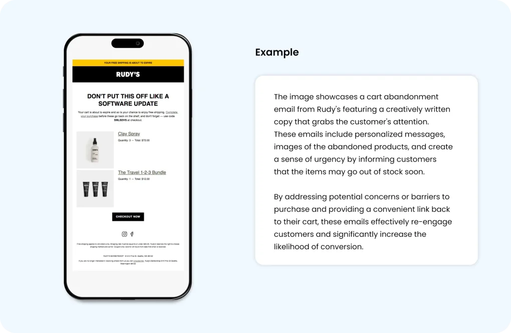
9. Utilize Abandoned Cart Emails: 

Implement automated abandoned cart emails. These emails serve as timely reminders for users about items left in their cart, effectively encouraging them to complete their purchase. Personalize these emails with product images, attractive offers, and a clear call-to-action to drive higher conversion rates. Additionally, consider incorporating customer reviews and testimonials within these emails to build trust and motivate users to finalize their transactions.
 

Source

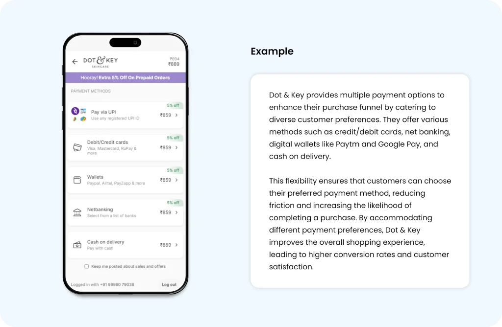
10. Offer Multiple Payment Options:

Offering a variety of secure and convenient payment options is essential to cater to the diverse preferences of your customers. By providing multiple payment methods, such as credit/debit cards, digital wallets, bank transfers, and buy-now-pay-later options, you can significantly reduce cart abandonment and enhance the overall shopping experience. 

Ensuring these payment methods are secure and user-friendly builds trust and encourages more customers to complete their purchases. Additionally, displaying payment security badges can reassure.
 

Source

In conclusion, implementing these strategies for improving the purchase funnel in e-commerce is vital for maximizing conversions and ensuring a seamless shopping experience. These strategies not only enhance user satisfaction but also drive sales and foster long-term customer loyalty. Investing in the optimization of the purchase funnel ultimately leads to a more efficient and profitable e-commerce operation.
10 Indispensable UX Heuristic Principles for driving high conversions

By incorporating heuristic evaluation into the CRO process, we bridge the gap between data-driven analysis and the need for quick, actionable insights. This dynamic combination allows us to make informed decisions that lead to significant improvements in conversion rates, user satisfaction, and overall business success.

As a CRO expert, I highly recommend integrating heuristic evaluation into your optimization strategy. Embrace the power of this efficient methodology and witness the transformative impact it has on your website’s user experience and conversion rates.

What is ‘Heuristic Evaluation’?

Heuristic evaluation is a process of measuring the usability of the user interface based on specific predetermined rules; the website/ app can be examined by the rules and report the issue.

Here the term usability is related to how a user perceives your website in terms of affordance, discoverability, learnability, flexibility, efficiency, speed and user control. The application of these components in a good manner will become necessary to improve the overall conversion rate.

If we apply this evaluation process to early-stage prototypes, it will be more beneficial for developing a good system. Because heuristics developed after years of experimentation on various types of e-commerce, business, blogs, and news websites. 

As a result of all these experiments, A model was developed that will evaluate what will work for a system conversion rate optimization. The model has certain rules of thumb that we can apply depending on the type of website and perform an A/B test to measure the conversion rates.

Heuristics Principles & Their Application

There are multiple rules of heuristics in which 10 general principles are widely used, first proposed by Jakob Nielsen in 1994, Depending upon the purpose of the website or app, some of the principles can be removed. We can understand the application of these principles with examples.

1. Visibility of System Status

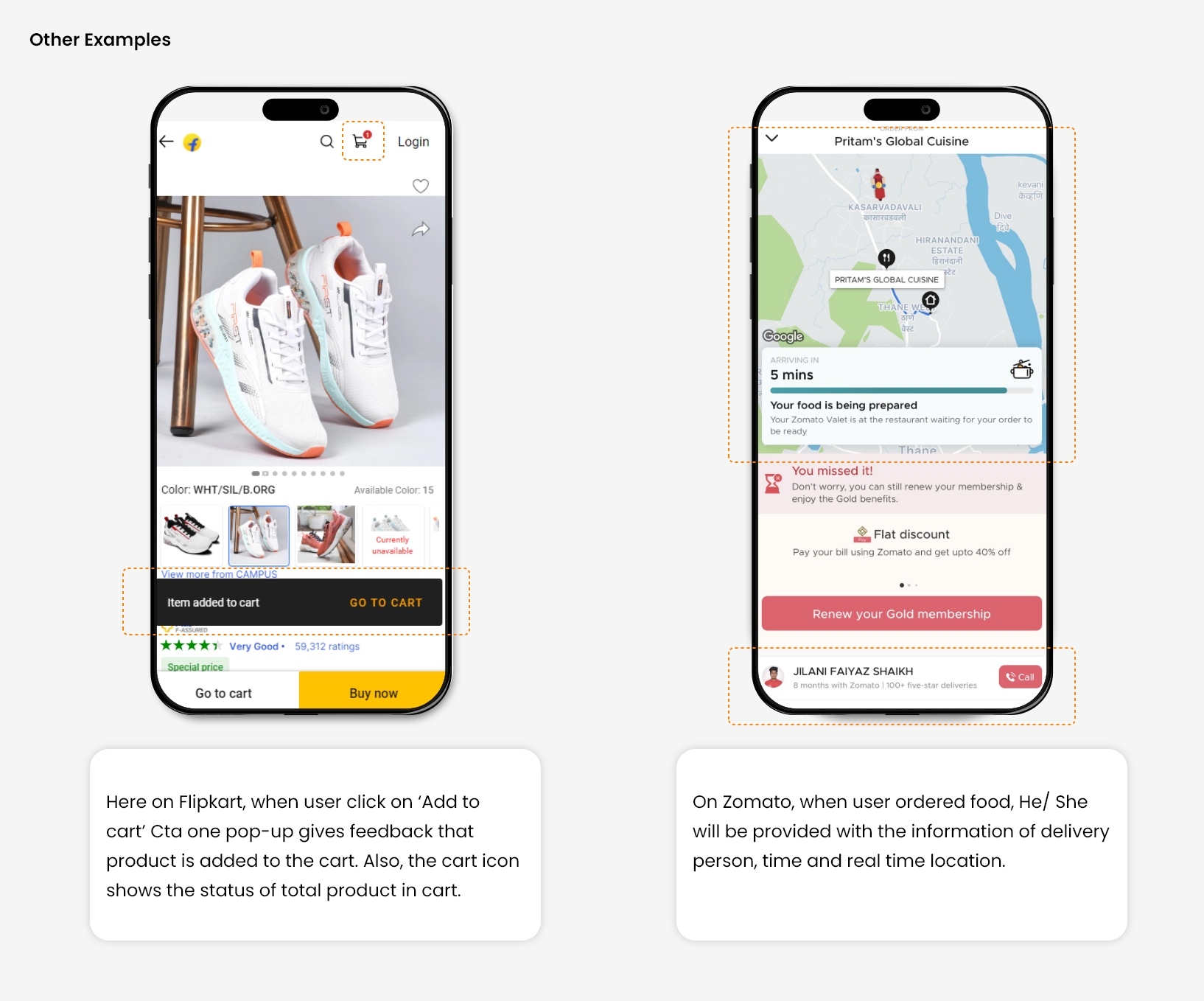
The system should give real-time information to the user about what is going on in the system with appropriate feedback. The user always expects clear communication in advance before taking any further action. 

Also, the system is not allowed to take any action on its own without prior notice to the user. The crystal clear information will increase the trust of the brand/ website, which is necessary for a user to take better decisions. 

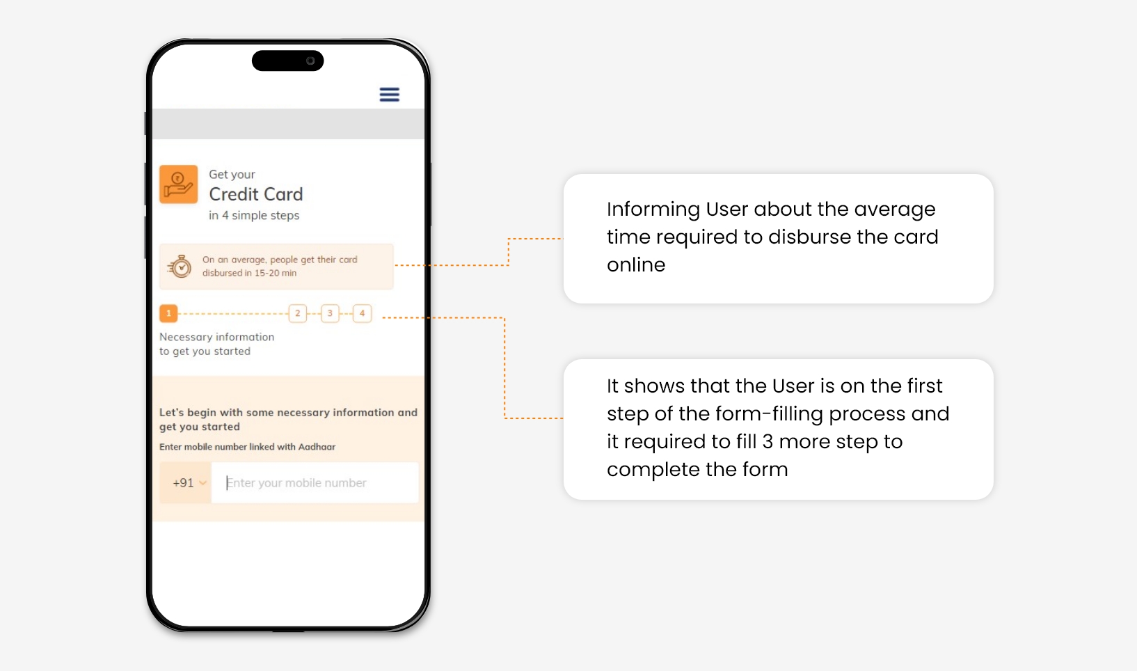
For example, In a bank credit card application form. The user is provided with real-time information about form filling status.

Source   Source

2. Match between the system and the real-world

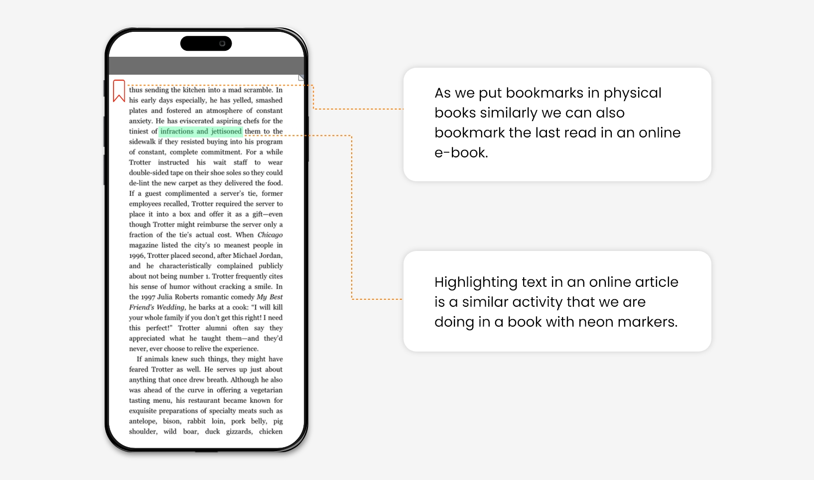
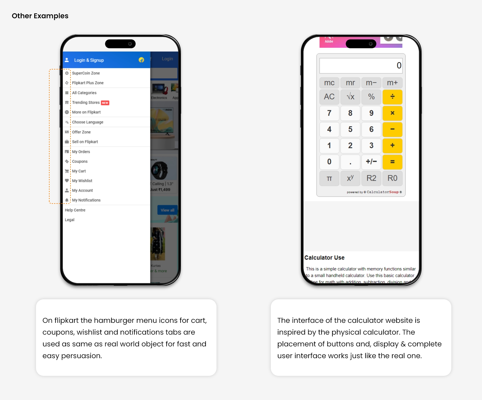
Design should speak about its purpose in the user’s language. If you design something, its language, iconography, and images can seem perfect for you and your colleagues, but that is not always true, it might be confusing for your end user.

The information delivered in the form of real-world conventions is more persuasive and easy to understand for a user without any language barriers. 

For Example, We can bookmark pages and highlight the texts in e-book apps as we do in physical books.

Source      Source

3. User Control & Freedom

If you are writing something with a graphite pencil, An Eraser will help to erase it, In case you have written something by mistake. Eraser gives you the control to correct your written text. 

In the digital world, Several times, users perform actions by mistake, so they always want control to correct them. In such a situation, users should provide a clear exit or solution without getting stuck to avoid frustration. 

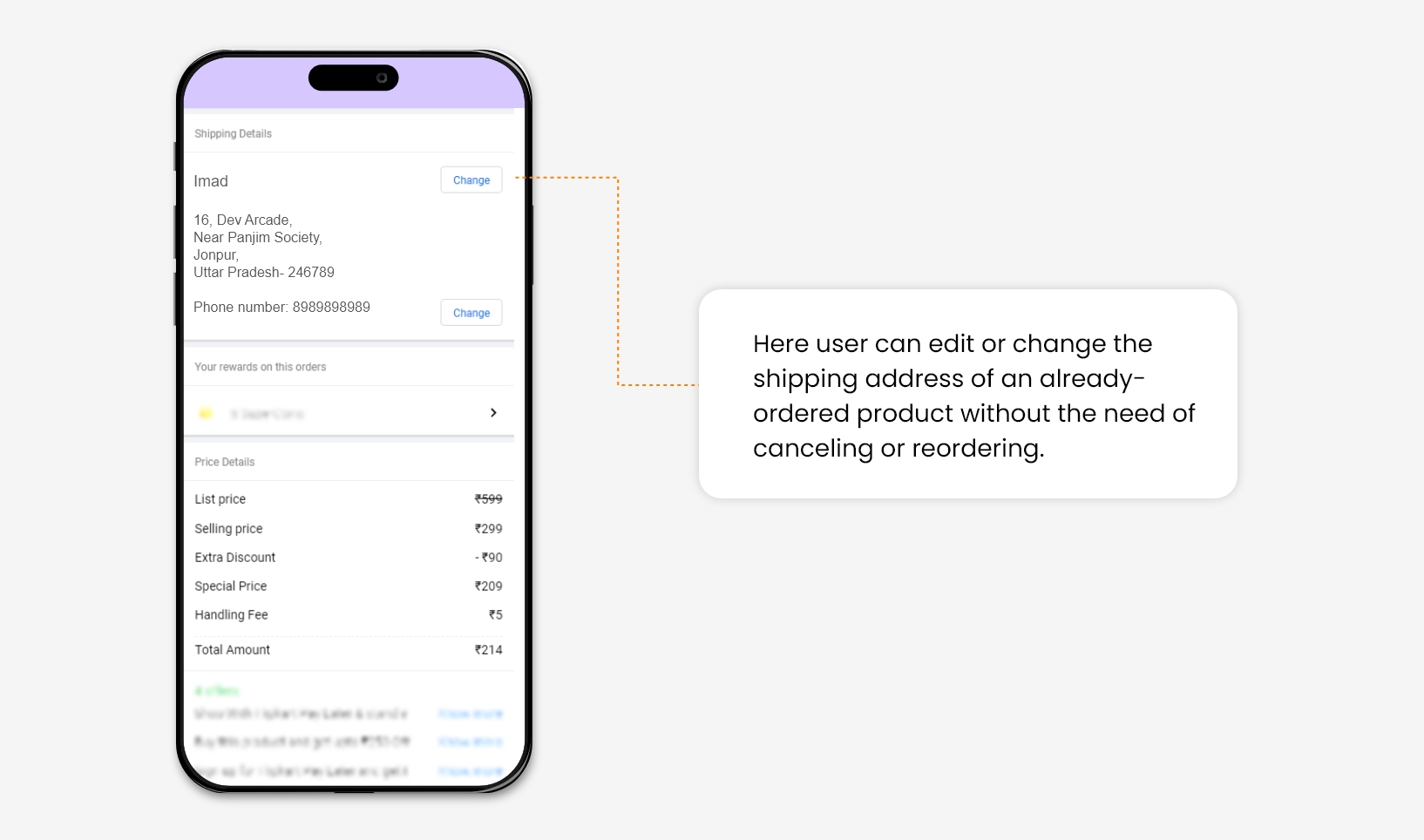
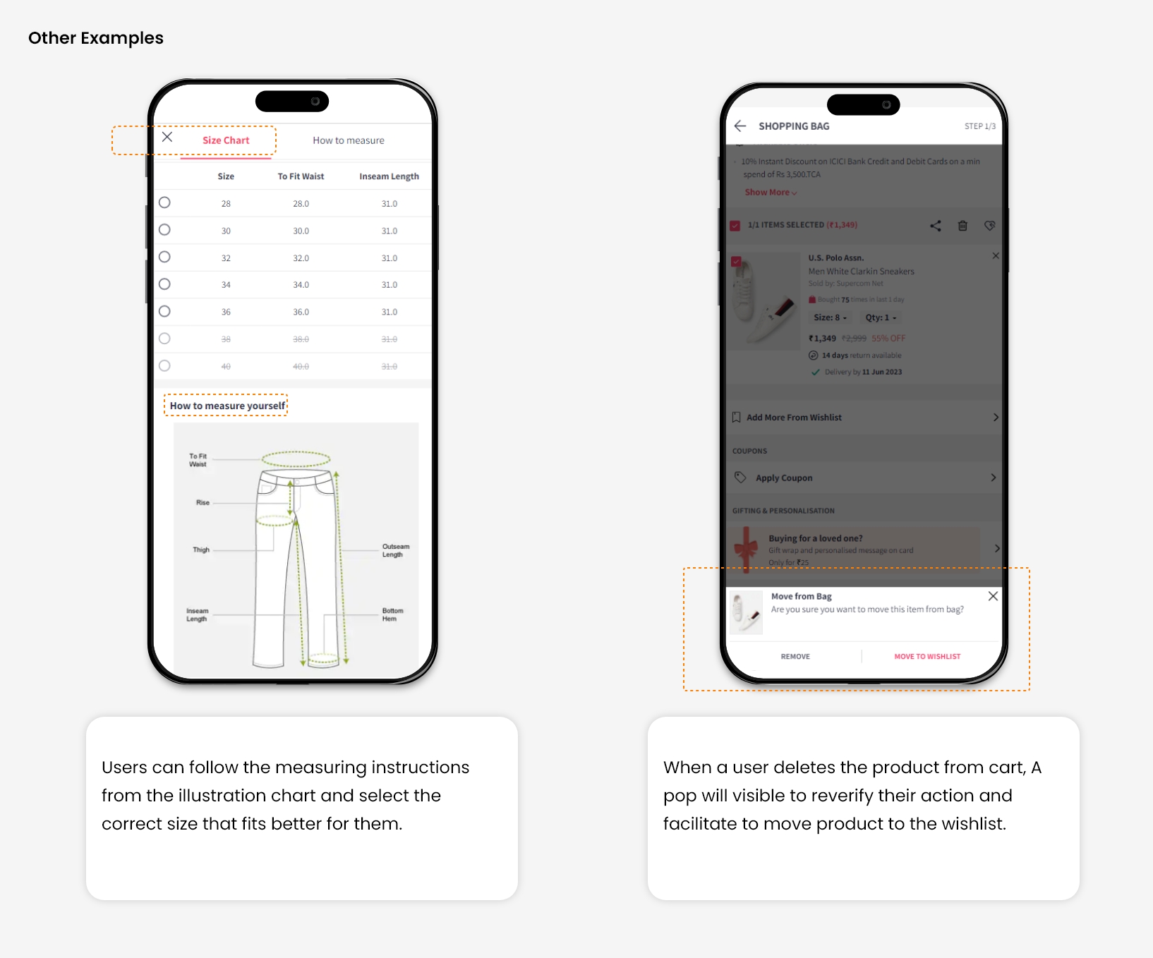
For Example, On an e-commerce website, many times, users save multiple addresses in their address book, which increases the chance of selecting the wrong address during checkout. So it becomes necessary to give control to the user for changing shipping address after making a successful order.

Source    Source

4. Consistency and Standards

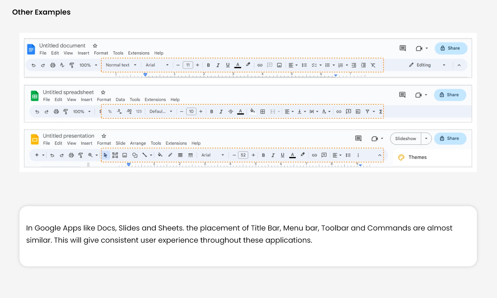
This principle very much relates to Jacob’s Law of UX design. It states that users always spend more time on other websites than yours. 

So they always expect the discoverability of elements and functionality of your website should work in the same way as that work on the other website. 

Users developed this behaviour on their own, Through their years of exploration of different websites. It helps them to perceive different elements or find specific functionality on a landing page with ease.

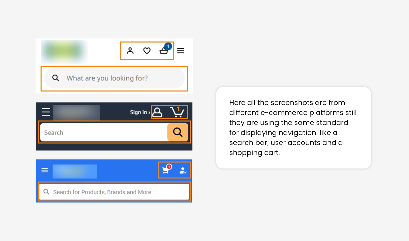
For Example, Most e-commerce websites use the same standard for showing navigation elements. We have observed that maintaining consistency across websites will reduce user bounce rates at first glance.

Source

5. Error Message

Error messages are important to warn users prior to their action, but good design always aims to prevent problems from occurring in advance. 

If the user commits any error or attempts something wrong, who will take responsibility for this? User or Designer? 

So, the answer is Designer. He designs the system in such a way that it becomes easy for a user to commit the error. The conclusion is that the System is always designed in a way that it becomes less prone to errors.

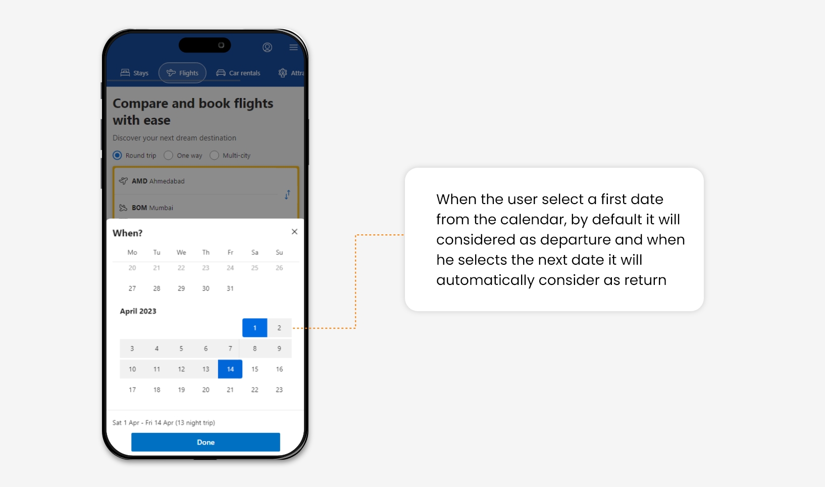
For Example, On flight booking websites, many times, the user makes the mistake of selecting the return date before the departure date. For a good user experience, a constraint can be added in the calendar that can avoid users from selecting any redundant date range.

Source      Source


6. Recognition rather than recall

While people cannot remember every detail of an event, they are capable of retaining specific parts. However, the act of recalling information can be burdensome on the memory.

Designers need to reduce the user’s memory load by making images, elements, and options visible at first glance.

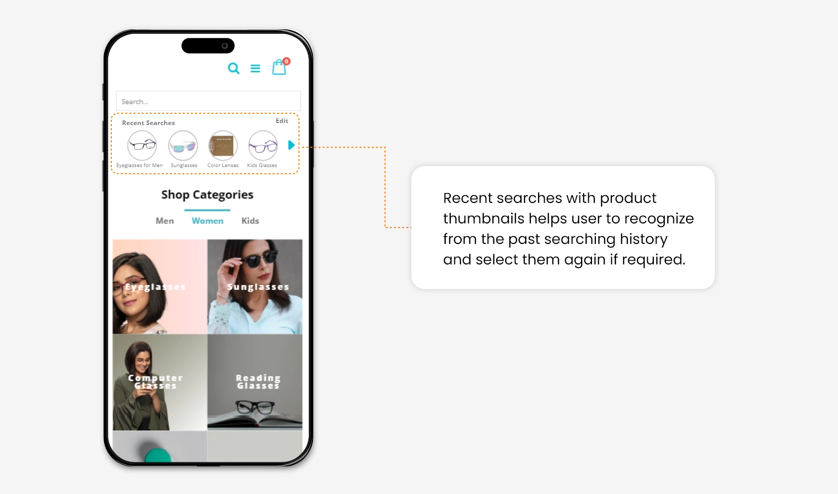
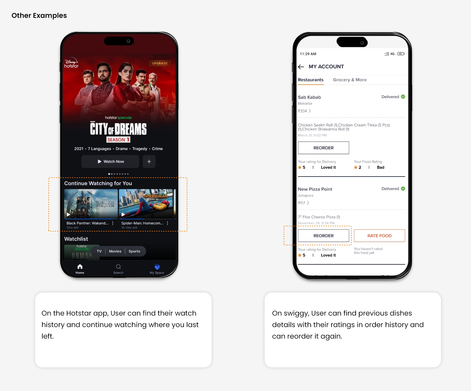
For Example, Once people search for a product on an e-commerce site and leave it. When they return and try to search again, it will be good to show them their search history. Because they are most likely to buy things from it that increases the website conversion rate.

Source    Source

7. Flexibility and efficiency of use

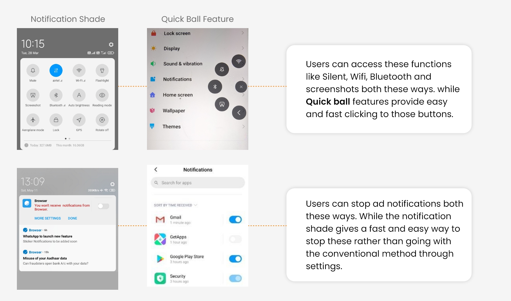
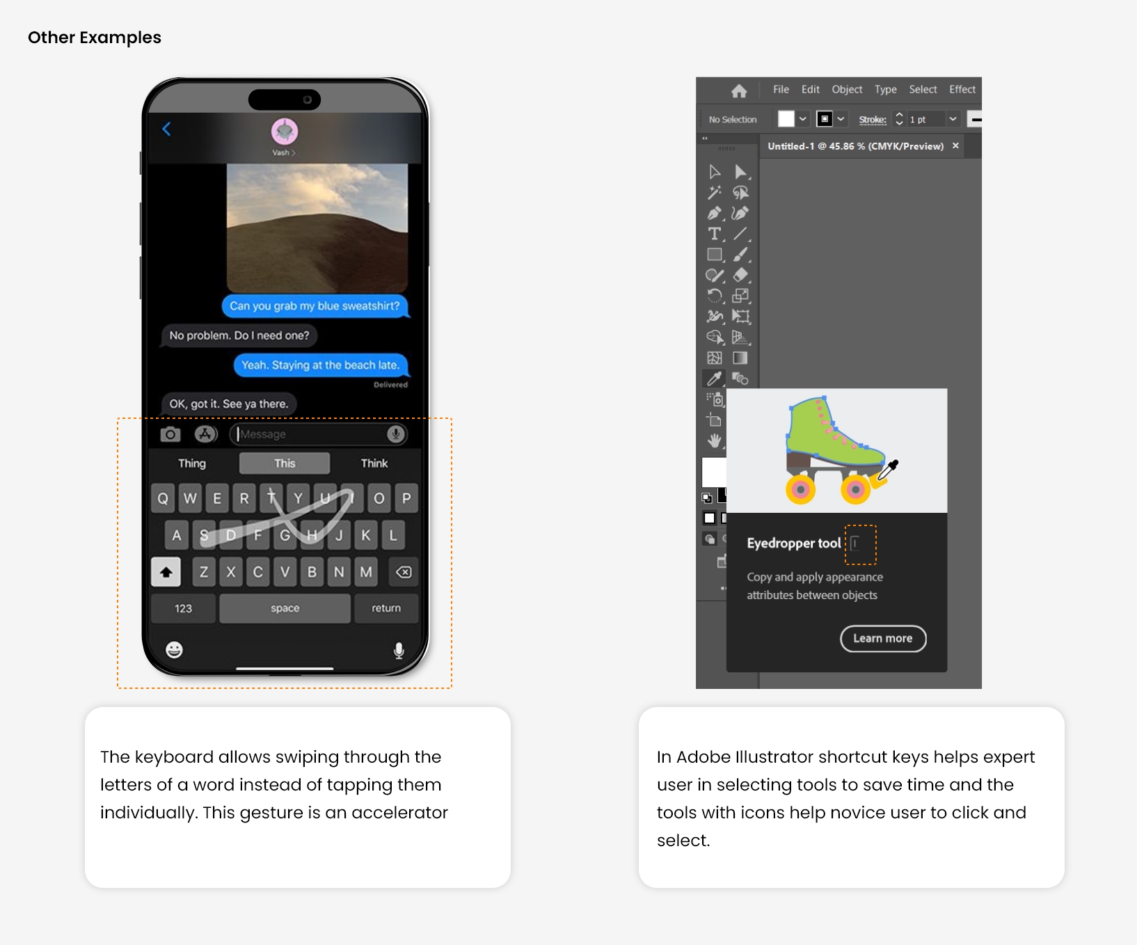
There is always two types of user, Novice and Expert. The expert user wants some facility that speeds up their work, like shortcut keys. 

Where a new user wants a simple and easy functionality, the designer needs to cater to both segments of Users so they can work efficiently. Also, provide the facility of personalization and customization as per user need.

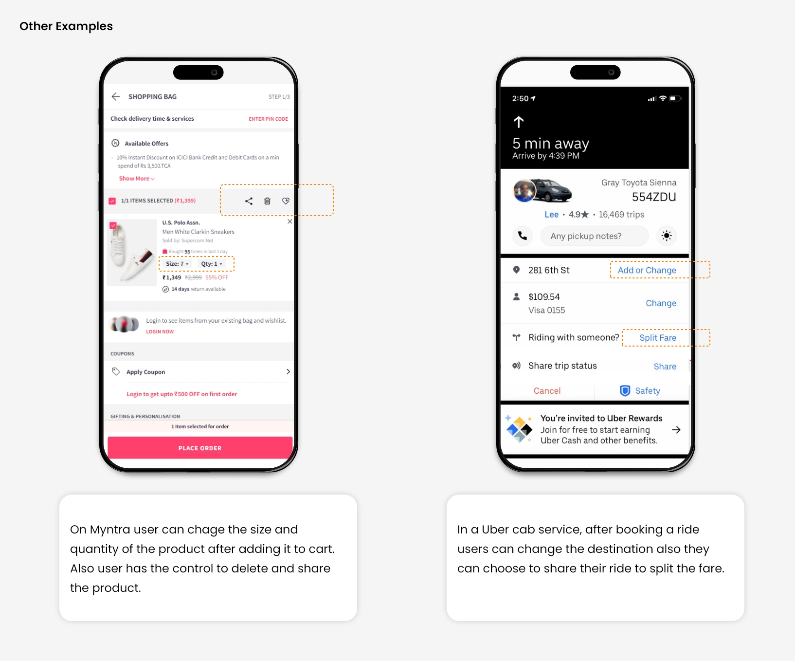
For Example, In mobile UI design, different quick access (Shortcuts) is provided for fast and easy navigation throughout the UI. It will save the user time and improve their overall experience.

Source

8. Aesthetic and minimalist design

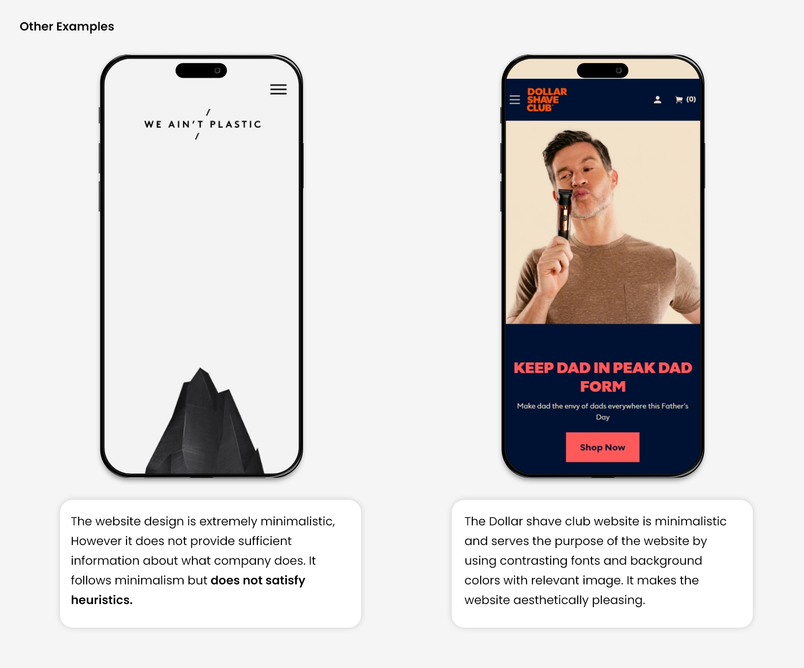
Many time system contains lots of elements and information In which, some of the contains are irrelevant and rarely used. Such content distracts the user’s focus from the relevant and necessary information. 

As a result, the user will not be going to perform the task that you are supposing from him. So, Before designing, you need to prioritize the visibility of primary and secondary elements on your landing page or interface.

Let, An interface that showcases only minimalistic design but does not contain relevant information and visa-versa, a page with relevant information not presented aesthetically will not be considered a good heuristic approach. 

A good design would be well-presented information with the use of design and gestalt principles.

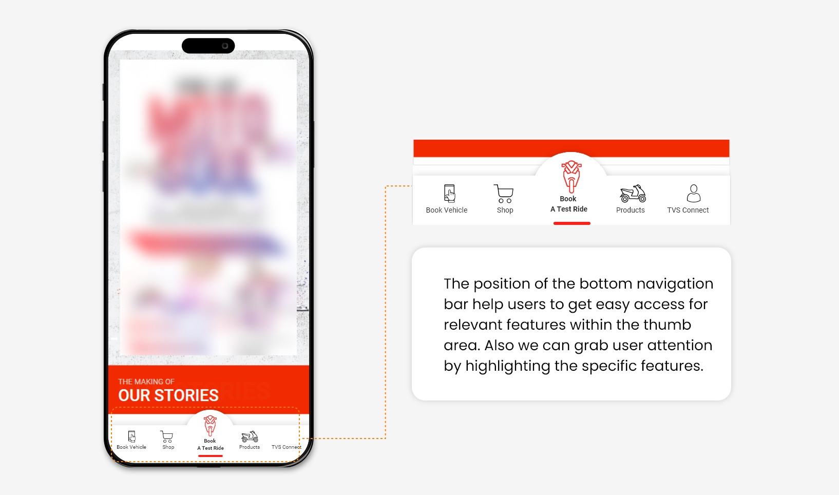
For Example, Giving a Navigation bar on the App at the bottom rather than on top with the most relevant options will help users discover specific buttons quickly.

Source   Source

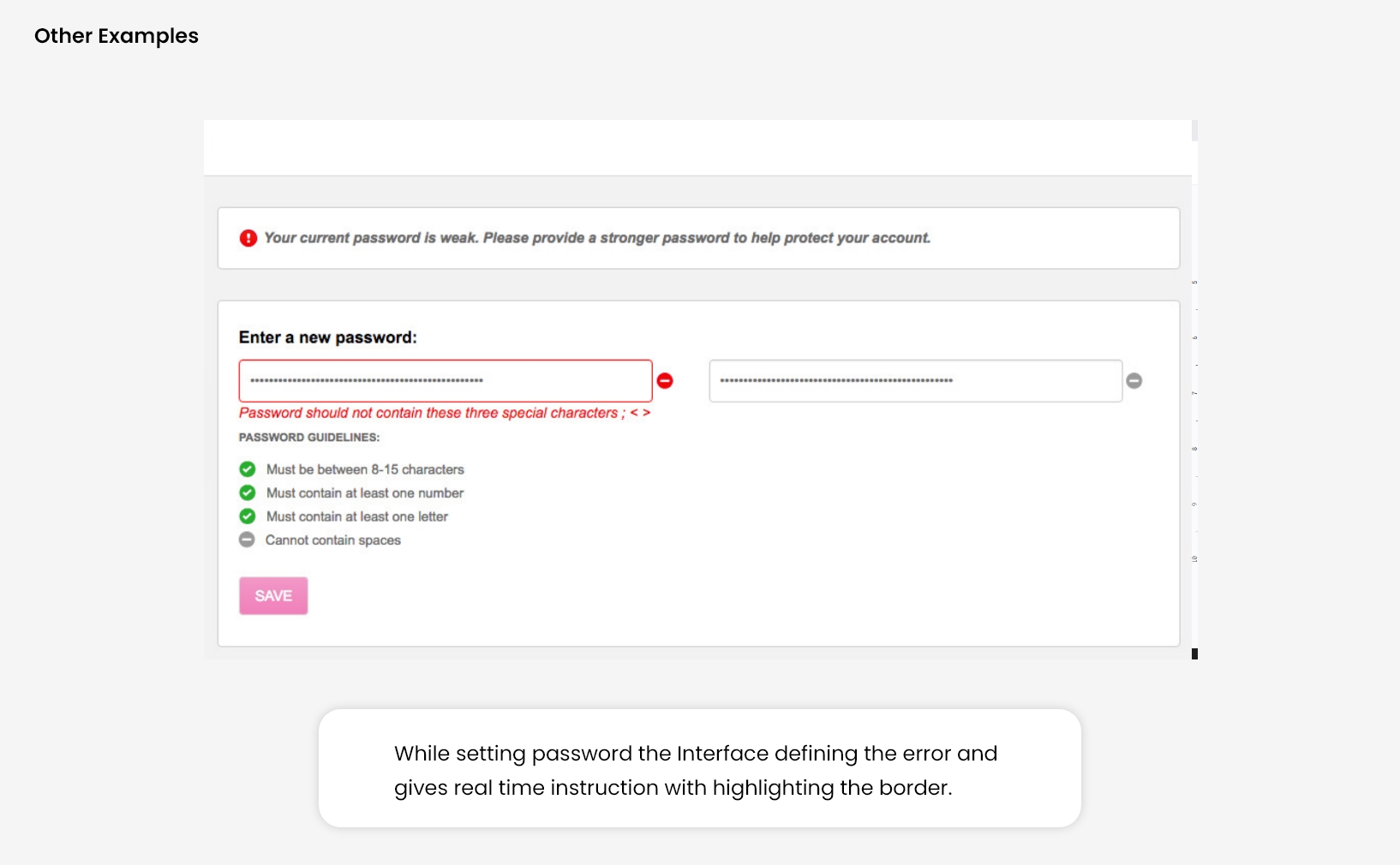
9. Help users recognize, diagnose, and recover from errors

Design should always focus on minimizing user errors. Still, due to some design problems or any functionality issue, the user will get stuck in some error. Now it’s the designer’s responsibility to give a complete and simple direction to resolve it to recover.

When a user makes a mistake and doesn’t get any feedback to solve it, they would most likely skip the task they were supposed to perform. Also, showing custom-written error messages is a good practice rather than system-generated error messages with code like ’404’.

Hence, Error messages are always kept in a simple language, which can be easy to perceive and also suggests a constructive solution to resolve.

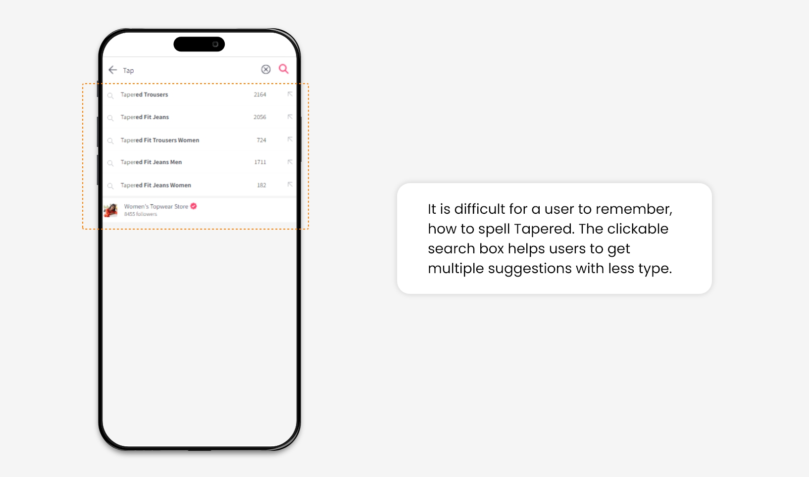
For Example, On an e-commerce website, sometime user forgot the specific keyword of the product for which they are looking to browse or purchase. The search option facilitates multiple suggestions once they initiate typing, which helps the user to recall the product’s actual name.

10. Help and Documentation

Designing a system in such a way that it becomes self-explanatory. It won’t need any additional explanations. However, It is good to help users by providing relevant documentation to accomplish their tasks.

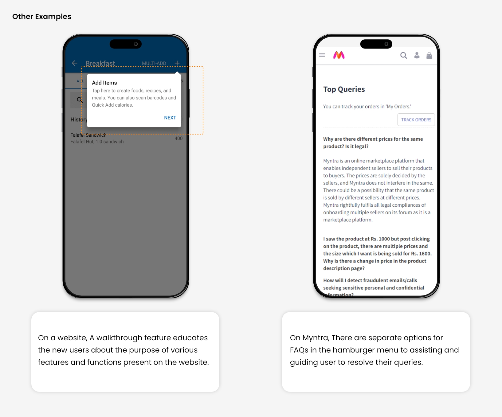
There are two types of help one is Proactive, and the other is Reactive. Both this type of help is widely offered at different online platforms. 

Proactive help focuses on preventing issues in advance. It provides help to the user before he/ She encounters a problem. It is intended to make users familiar with the interface by showing some tips, suggestions, and training tutorials. 

While Reactive help stands for helping users when they have already encountered a problem and seeking a quick solution, it includes some advisory documentation, videos, and well-segregated videos for specific issues that are easily accessible.

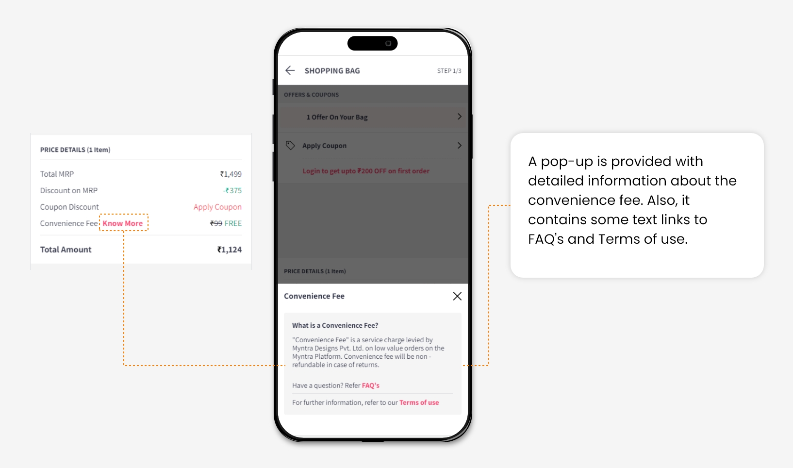
For Example, At the checkout page of an e-commerce shopping website, a convenience fee is charged. So It is necessary to inform users why it is supposed to be included in the Total amount. By clicking on “Know More’,  A task-specific help document will be provided.

Source

Conclusion

All these minor changes can enhance user experience and help us to increase user engagement on your website.

In many A/B tests, we have applied changes according to heuristics and observed that consideration of all these principles while designing the website interfaces gives better results in increasing the Overall conversion rate of the website.

5 Mistakes Marketers make while running Advertising Campaigns

Advertising campaigns can be easily underestimated especially when you have a smart DSP platform, like DV360, by your side. Easy decision making AI and ML enabled mechanisms are streamlining each and every stage of the media buying process. It checks everything right from defining the relevance of impressions to serving it on the web page or app. 

If you’re a beginner in Digital Marketing, you might think that CPM or PPC campaigns are nothing but a magic tool to get more sales and engagement. It will, only if you know who to target, how and where. If you’re using a programmatic DSP, like DV360, it is of utmost importance to realise that these sophisticated technologies won’t give you results if you have poor creatives, a weak strategy and erroneous set targeting. 

If your campaigns are not showing results, you’re probably making one of the mistakes listed below

Mistake 1: Prioritizing Revenue over User

When you have a big ad budget, it’s hard to avoid the temptation of placing it on every webpage possible. The problem? Many ad-units are considered to be extremely intrusive because they interfere with the user experience. That’s the only reason Google Chrome is now blocking ads like autoplay videos.

How do you make these ads friendly and profitable?

You need to diversify your media mix. You just can’t stick to banners as there are a plethora of ad formats that don’t just engage your prospects but entertain them too. Comes in the popular mobile game playable ads, rewarded ads or a video. 

Instead of the traditional ad the user plays a game for 20-30 seconds. When that mini-game is over, the user can decide whether to install it or not. This concept is just next to perfect for CPI models as it brings in an audience that doesn’t uninstall the app immediately after installing it. 

Furthermore, there are many video ads you can experiment with starting from interstitials, in-banner videos to in-stream formats. It’s proven that video ads are far more effective than static ones and have the capability to accommodate information that’ll fit in just one banner. Moreover, they work well with mediums like in-app, on desktops, mobile and connected TVs.

Even Native ad formats are great for almost every screen and platform. These ads are considered to be less intrusive as they have the capability to blend in with the content of the platform. They’re helpful in raising brand awareness with entertaining content. 

Mistake 2: Not Knowing the Optimal Frequency of Ad Campaigns

Selecting the right frequency of impressions is considered to be one of the most crucial steps. By displaying the ads to the user too frequently you’re risking your brand’s credibility. It’s like asking users to apply ad blockers. 

According to the recommendation by Google, impression frequency can be calculated by a formula and you can use it to calculate the number of impressions that will add to your marketing campaigns

Formula: Average impression frequency = Audience impressions divided by Unique audience

Frequency of 1 means that the users will watch the ad once a day, 2 means twice and so on. 

If you’re showing your ads to users more than once a day, it’s a good practice to show them on different gadgets. For that you need to create several versions of the creative adapted to each environment

Keep in mind: Always calculate the optimal frequency before running the campaign to avoid overserving and under serving your Audiences

Bigger brands with a big target market usually keep their frequency cap to once or twice a week. While comparatively new brands succeed with shorter campaigns with a niche audience and higher frequency.  

Mistake 3: Not following the targeting steps while planning the advertising campaign

You should always include targeting because lazy targeting undermines the strongest of campaigns. Targeted ads are twice as effective as non targeted ones. For instance, geolocation targeting can turn out to be very important for geofencing and geo targeting campaigns and geo referenced businesses.

There’s no point going too broad or too narrow with your target audience. Narrowing your target audience translates to higher conversions because you are not paying for impressions that will not convert. Also, avoid setting it too narrow as your traffic would go down. If no one clicks on your ads, it’s probably because your target audience is too narrow. 

Mistake 4: Not measuring the effectiveness

To optimize your campaign properly, it’s important to review the performance and analyse the effectiveness of the steps you took while planning your campaign. To start with, you should keep in mind the initial goal of your ad campaign, be it number of clicks, conversions or just the number of impressions served.

On programmatic platforms, you can point out the dynamics of your ad campaigns in real-time. All you need for this is to aim for for a period to see the number of impressions generated and conversions. You can also see how your CPM, spend changes, move your bids and wins 

When you start tracking signals of user behaviour from the website and app using pixels, you’ll be able to understand what actions lead to conversion better. This will help you take a more data driven decision making and strategy development for your marketing campaigns. 

Mistake 5: Setting up campaigns & Forgetting about them

Automated advertising systems can help you set up the campaigns and forget about it easily. After registering, you fill out forms, download creatives, set daily budget spend, frequency and that launches a campaign on preferred media channels. Programmatic ad-buying automatically finds the right audience for your campaign, makes bids and serves ads to those users. Still, it’s of utmost importance to optimize the campaigns to keep them above the breakeven line and avoid spending much. Teams can also use marketing project management tools to effectively plan and monitor the campaigns and have complete visibility.

Use Pareto’s principle for optimizing your campaigns. Segment your Target Audience into categories using value like generated sales, profits, CLV, among others and remove the bottom 20 percent from targeting. Then further subgroup the rest 80 percent in two categories like the common and best performing. Analyse the clicks and conversion each group generates. Then set the higher bids for the top performing category.

Like the way you optimise your TAs you can optimise the ad spends and then list (black & white) partners according to the results. In an ideal situation you should optimise your campaigns every few weeks or at the least every month. If this falls behind the cracks, you’ll need to ask your provider for managed serve campaigns. 

The bottomline is…

Every small piece like the frequency capping or targeting option have a big effect on the performance of the campaign. Use media mix across channels, approach user experience with sympathy, set up targeting and frequency wisely. After all of that is done, analyse your campaigns thoroughly to see the path you’re taking and what you can do to achieve those desired results. 

Want to run an effective Ad campaign? Let us do the hard work for you. Contact us now!

The Insider’s Guide to using User Experience to Increase Engagement with GA

User Experience is one of the main elements that differentiate you from your competitors, both physically and virtually. To increase your conversion rates you might need to completely change your UX. The question is: Where do you even start? How do you pinpoint what your users and prospects want? 

It’s pretty easy to make excuses and say you know what users want without any research or investigation. You have to be a learner, humble and smart enough to draw conclusions through data analytics for a better customer experience. Let’s start at the bottom - Google Analytics. This blog post will help you extract insightful, actionable data. 

After reading this post you’ll be able to see each component and extract data from the same. 

The four basic analytics components that will help you work on your UX are:

  • Bounce Rate
  • User Behaviour
  • A/B Test
  • Customer Surveys

Bounce Rate

In simple terms, the bounce rate is when a user lands on your website and leaves it without interacting with the page. 

Having a bounce rate of over 70 percent is something you don’t want. That’s like 70 out of 100 visitors didn’t find the info they were looking for so they exited the page. You need to check your web pages for the following issues:

Navigation Issues

Website navigation is like a funnel. It should be properly organized and grouped. Ideal navigation would be something that a user can predict. Having complicated and unorganized navigation will only create confusion with your website visitors. 

The best way to find out issues with the navigation is to see if users are clicking on each item. If they aren’t, consider dropping some items or think about restructuring it all together. 

User Behaviour

Whenever someone visits your website and does something, it’s called user behavior. It includes the journey within the pages of your website, and the actions they take through form submissions and link clicks among others. 

Analytics helps you understand the user behavior of your website in a much better way than just guessing. With user behavior metric you’ll know which part of the page is the users interacting with, what forms are being used consistently, are there any pages people don’t even care to visit? Optimizing your website after knowing the user’s behavior will help you increase engagement and convert your prospects in a much faster and better way.  

Your Visitors 

User Journey will enable you to see the bounce ratio, drop-offs, and exit pages, enabling you to improve user experience. If you see a high bounce rate on your service or product page you need to re-think your page design and content. On the other hand, if you see a few people visiting those pages, you might have some issues with previous pages leading to that page. 

Acquiring new users and converting them might sound cool but converting the returning users is of a much higher value as well as a low hanging fruit as well… They’re deeper inside your sales funnel as they know your website, content, and services. New visitors are just getting started on your website. Lower the returning visitor session higher are the issues with your website UX. 

Time Spent on Website by Users

Time is another important thing to look at. It’s important to understand how much time a user spends on your website and pages. A user spending more time on a page might be a positive sign. The word might here indicates the possibility of users getting confused or having no clue what to do next. Your users should be able to predict the next steps. If they aren’t, maybe, they didn’t find the information they’re looking for. If you see this happening, take action immediately. 

What should you do?

Make sure all your links and CTA’s are working. Also, make sure the page with a high bounce rate has a uniform UI design and a right CTA in place. Use heat maps in Google Analytics to make sure users are viewing the complete page and taking relevant actions. 

Red areas represent more clicks, while blue indicates less. If the users are moving too quickly around the page there might be missing information or image on the page. Check the interaction, time spent on the page and content you have above the fold. Change it and use A/B test to measure results

Customer Surveys

Customer Surveys are a great way to get specific answers from your end-users. It helps you optimize the UX based on real feedback. If you have a high bounce rate on one page more than another, asking your end users a specific question might help. 

Let’s say you have created a web interface following the standards of the industry. But possibly that design is not working for your audience. In this case, observing the heat map analysis might be of no use, but reaching out to your users would definitely help. 

For instance, the red color might not work in the western world while in Asian countries it might be one of the strongest colors to follow. Every company conducts surveys when they update their designs or launch a new product. This helps them serve their end-users better in terms of design and content. 

A/B Testing

Analytics helps you pinpoint the lagging parts of your website. Now, you need to create a design strategy to address those issues. Start by making a list of elements to be redesigned. A/B testing is a strategy you use when you want to apply those changes to the pages of your website. Making all the changes at once is a bad idea. Instead, we would recommend you to first change the fold section and alter the CTA design. You can always start with pages that see high engagement but also have a high bounce rate.  

Your new design will become the part ‘B’ or the variant of your original design. You can then set up an A/B test on your website or app and send some users to the new design. Then measure what works well.   

The best way to measure is to compare both the variants & basis your experiment goal - which is to increase engagement in this case, then obviously the one with better engagement and lower bounce rate is the winner.

An ideal A/B test would involve 

  1. Identifying the flow & creating a hypothesis
  2. Creating a new design based on the hypothesis
  3. Run the experiment to measure engagement and bounce rates
  4. Repeat the strategy until you get a result with expected figures.

The Bottomline is…

Analytics can help you understand your end-users in a better way. You can always trace the parts that are causing issues via website interaction, bounce rates, engagement, among others. Fixing these issues will enable you to improve engagement and conversion rates on your platform. 

Get an audit of your Google Analytics today!


Bot Icon
Bot Icon

Tatvic Bot

Explore About Tatvic and Services