Hello There!

Lorem ipsum dolor sit amet, consectetur adipiscing elit,

 About Malav Shah

Malav Shah is a creative designer at Tatvic Analytics. He specializes in building dynamic creatives and interactive rich-media creatives. His interests are in programmatic advertising, games, travelling, and movies.

How to implement Google Analytics 4 attribution Models?

It’s no secret that the new version of Google Analytics (called GA4) is already taking over the market. And opinions are abuzz. In this series, we are focussing on how to take advantage and succeed. As, this new version is here with some exciting additions like integral machine learning models, AI-based predictive audience, and cross-device measurement capabilities.

For this blog, we have picked up one of the most talked about topics in the world of data analytics - Attribution Modeling.

 The ability to analyze marketing data across all of your channels is critical for any business growth. This might include getting answers on:

  • How can you assess your channels to know exactly where to invest more?
  • Which ads make potential customers move to the next step in the funnel?
  • How is the value of a conversion distributed across channels?

 Well, it’s all about getting the attribution right, the one that makes sense for your business.

The previous version of GA, widely known as Universal Analytics 360 is based on the last non-direct click attribution model, by default. It provides an option to choose different models but temporarily within multi-channel funnel reports and reflects on just those reports. On the other side, GA4’s default model is data-driven (I know pretty exciting) but it also provides an enhanced feature where you can change the model from Property Settings. And you guessed it right, the impact will be seen on all the reports. This will ensure deeper and actionable insights since all your conversions and revenue reports will now be based on the model most apt for your business.

We will talk about DDA in more detail in our next blog, but for now, let’s take a look at how you can make these changes within the GA interface.

Configure Attribution Settings - 

Let us take you through the UI and understand how you can change the reporting attribution model in GA4. I have a sample GA account and a sample GA4 property created under it. I will be using these for our walkthrough today.

For ease of understanding, we have also created a HOW-TO video to help you navigate through the Attribution settings better. Feel free to view the video if you prefer watching and learning.


  • Go to the Admin settings from the left-hand side navigation 
  • Click on Attribution settings under the Property column

  • Click on the drop-down here that says Reporting attribution model

  • Here you can see various types of models available that you can choose from

The different models available in GA4 are Data-driven, which is of course the recommended and default one, Cross channel First Click, Last Click, Linear, Position-based, Time Decay, and Ads preferred - Last Click. You can practically select any of these to be your preferred attribution model enabling you to look at your reports in a way it makes more sense for your business.

There can’t be a one-size or suggested attribution model for all businesses so before you go and choose one, you need to understand all types of models. Write us below in the comments section if you want us to cover the models in detail in a separate video. Coming back,

It is also mentioned here that this will be applied only to conversions and revenue. 

Next on the page is Lookback Window Settings.

Through this setting, we can select how far back in time a touchpoint is eligible for attribution credit. This would be based on your general practice as a business, whatever has been working for you strategically. If you select a 30-day lookback window, for example, it will result in today’s conversions being attributed only to touchpoints occurring in the last 30 days.

It is very important to note that the lookback window will not be applied to historical data but will impact data from that point onwards and then these settings will affect the data permanently. 

Once you select your model and lookback window, scroll down and click on Save; your data and reporting will now be based on the new model selected.

Concluding Thoughts-

Whatever model you may choose concerning your business requirements, attribution modeling will ensure that there is a holistic view of the journey across all devices and platforms. This is a strong feature introduced by GA4 empowering advertisers to develop deep insights, make better decisions, and adjust their efforts accordingly. For example, if your top marketing channel converts 10% of its touches it could mean that you need to change your strategy for the underperforming channel.

We have some amazing ready-to-use solutions and reports on attribution modeling and GA4 in general, so reach out to us to see what’s a good fit for you and your business.

While we have a series of blogs planned for our readers, watch out for our next blog on the Data-driven attribution model coming soon.

4 Firebase App Analytics Metrics for Gaming Product Managers

4 Firebase App Analytics Metrics for Gaming Product Managers

User behaviour is drastically different on mobile apps as compared to websites. This change needs to be reflected and tracked in your analytics tool too. Have you ever faced difficulty answering the following questions while analyzing the app data?

  • Is the app interactive enough to keep users engaged and convert effortlessly?
  • Is it possible to target audiences based on their behavioural aspects and past activities in mobile apps?
  • What are the factors that lead to an app being uninstalled frequently?
  • What is the best time to launch new app updates, or run relevant marketing campaigns?

To understand your mobile app users and their behaviour, Google Analytics has introduced a platform for app analytics. It is called Google Analytics for Firebase and it is a one-stop solution for app implementation and tracking activities. It’s a one-for-all tool that can be leveraged by app developers, marketers and product managers. In Firebase Analytics, data is collected in terms of events and users as opposed to sessions and screenviews like in Google Analytics. This enables product managers to analyze user actions while using their apps.

In this post, I am going to walk you through some insightful analytical features of Google Analytics for Firebase. The aim is to help you analyse the user behaviour and enhance your app experience based on the insights generated from each of them.

Feature 1:

Event-based funnel analysis

Firebase Analytics has a default report called Funnels. This report helps us understand the systematic actions taken by app users on a generic basis. It touches upon different points in their journey to complete a series of events including where they drop off in the particular process. These are open funnels, which means that users need not have completed the previous step in order to be included in the metrics for a subsequent step.

Setting up these funnels is a simple process. All you require is the basic Firebase event tracking implemented in your app. Once that is done, you need to add a series of events as steps to a particular funnel, in the sequence you wish to analyze.

Insights & Takeaways

  • Funnel analysis in Firebase Analytics can deliver insights on changes in user actions i.e. features depicted in the funnels report. The report indicates the step at which maximum users drop off. This helps you to make the necessary changes & optimize your user’s app experience.
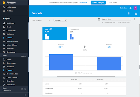
      • For Example: Let us take a look at the following report on a gaming app. It shows the total users at a particular step and the ones that moved to the next step:
      • In the above report, level_start indicates the start of a game.
      • The report considers all those users who opened the app as soon as it was installed. And it goes on to see whether they started using the game right away or refrained from playing the game consistently.
      • Now from the report, almost 67% of users are retrying a level before they can complete it.
      • In such scenarios, you can run A/B tests on such segments to help them reach the next level of the game. You can do so by switching their current level into an easier one to play on if the retrial count exceeds a certain number. This will keep them engaged in the app and encourage them to continue using your app.

Feature 2:

App uninstall analysis

Firebase provides a set of default events that are tracked automatically, whenever any user performs actions corresponding to those events. App uninstall is one such event that makes

Firebase Analytics is a unique app analytics tool. App Uninstall event app_removal is available in reports without any explicit implementation.

Insights & Takeaways

  • You can use this event report to understand the behaviour of your users who tend to uninstall the app after performing a certain set of actions.
  • Moreover, you can also build a funnel of all the important actions in your app, with the app_remove event being the last step. This will enable you to get details about a particular set of events that might have led users to uninstall the app.
  • Based on these insights the product managers can work on improving the user experience by either providing them with a different set of features or by enhancing the existing look and feel of the app.
  • You can also study the app uninstall events report data collected by Firebase by filtering it out for the app_remove event, and get insights like their geographical location, demographics data, etc. on a segment of users who already uninstalled the app.
  • For Example: The above report is for the same gaming app we saw earlier. This report shows that around 2K users started playing the game, out of which 67% of users re-tried the level out of whom 55% uninstalled the app.
  • Applying a filter of ‘new’ users, it can be seen that a lot of new gamers are uninstalling the app as they are not able to move forward in the game. We can personalize the experience for such users, and give them some advantage in the game to keep them engaged with the app.
  • Moreover, with an integration that’s possible between Firebase Analytics and Google Ads (AdWords), you can also create an audience segment consisting of these users and remarket to them with some special offers in an attempt to gain them back.

Feature 3:

User Retention Analysis

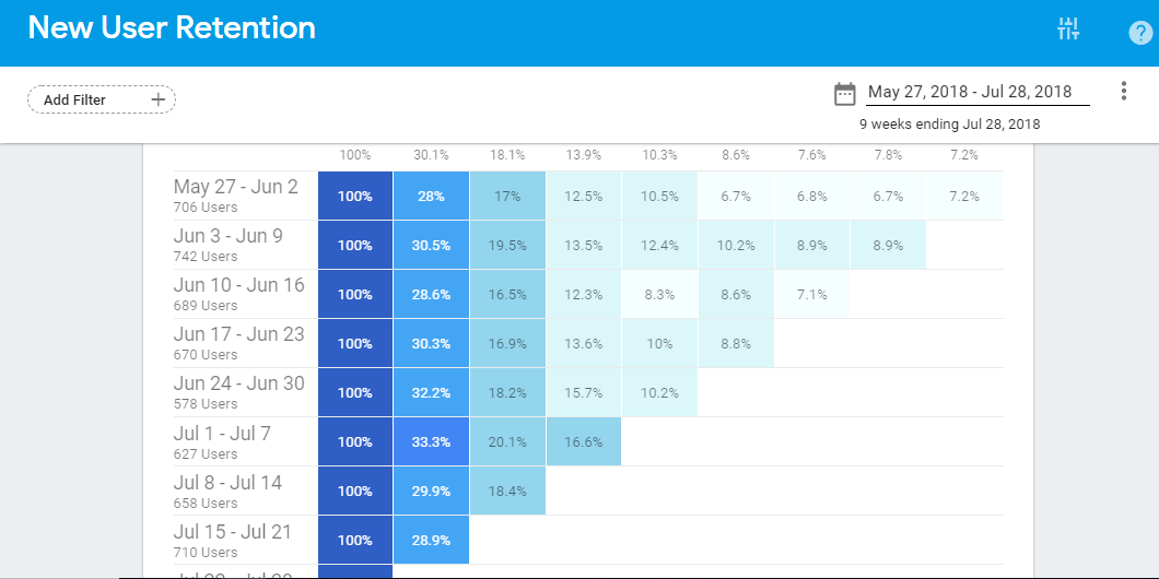
The graph in the User Retention Report shows whether users acquired on a particular date/week continue using the app at a greater rate as compared to users acquired at a different date/ week. The report provides insights into the most suitable time for running any new campaigns for acquiring new users remarketing to existing ones or for releasing any new feature.

Insights & Takeaways

  • For example, the following Cohort Report for our gaming app reveals that users acquired between June 3 - June 9 have a higher retention rate after 2 weeks along with an overall higher retention for all weeks as compared to other cohorts.
  • Similarly, the users acquired in the week of Jul 1 - Jul 7, have a higher retention rate as compared to other weeks in that month.
  • The above insights suggest that the business can target the first week of every month to run more campaigns related to user acquisition.

Bonus Tip: Another option is to track user property like “user acquired” (date when a user was acquired) or “last used” (the last time the user interacted) in your app, and use it as a target for the Notifications feature of Firebase, showing them some offers like maybe some incentive on crossing 5 levels of the game, and so on, to keep them interacting with the app and eventually retain them as customers.

Feature 3:

App Crash Analysis

Firebase Crash Reporting is a lightweight and real-time solution for all app crash-related insights that developers need, to ensure a seamless user experience. It groups all relevant crashes for you and provides details about scenarios that led to the particular crash.

Analysis & Takeaway
  • You can rectify the errors shown by Crashlytics, deploy these changes instantly to all users with Firebase, and check its real-time effect through Streamview report in Firebase Analytics Console.
  • This saves a lot of troubleshooting time for developers and helps them enhance the app effectively.
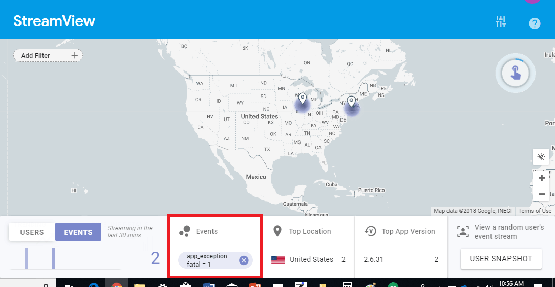
  • The above report shows all real-time fatal exceptions i.e. crashes with the help of app_exception event. App_exception is tracked by default in Firebase.
  • It suggests that there were 2 app crashes in the last 30 minutes from the United States in the app version 2.6.31.
  • You can go to Crashlytics and check the details of these issues, by filtering the report based on the ‘Crashes only’ event.
  • Crash Insights feature in Crashlytics report analyzes aggregated crash data for common trends from different apps available in the market. It highlights potential root causes and gives additional context on the problem. You can get details on probable cause, actions that need to be taken and resources to refer to, improving your debugging efficiency.

Conclusion

Firebase Analytics tracks data in terms of users and events very efficiently. It has all the app-specific metrics readily available for analysis. App analytics is tightly integrated with all other functionalities offered by the tool. Also, with a single Firebase Analytics SDK to be implemented, it is easy to personalize/customize the app and target the right audiences for campaigns. Moreover, if you are interested in knowing more about Google Analytics for Firebase, watch this space for my next blog post where I shall talk about a few of the most important features & integrations with other Google products of this app analytics tool.

If there are any analytical points that you perform with the help of Firebase, I would love to hear about them. Tell me about your unique and insightful analysis in the comments section below. I will include the best one in this blog with all the credits where they are due!

Understanding Your User’s Form Fill-Up Journey by implementing Form Field Analysis in Google Analytics 360

A successful, well-designed website majorly contributes to the user experience provided by a business to its visitors. One of the most important aspects that make up a seamless user experience is a web form to capture the user data. These forms act as a communication bridge between a website and its visitors. However, users are afraid of getting spammed, some feel insecure sharing their details, and for some filling out a form is just too much effort compared to the value they get. This results in users dropping-off from a website, and ultimately a loss of prospective client. Optimizing these forms changes all that.

It is important to understand your target audience and the way they interact with your form in terms of browsing and navigation behaviour. Such studies prove fundamental in designing a form that helps building trust in your businesses.

Form Field Analysis with Google Analytics 360 helps you understand this pattern and the drop-off rate of users from each such fields. You can refer to How to carry out lead gen form Analysis using Google Analytics blog for more details.

Funnel Visualization report generated from the Form Field Analysis helps to identify the user entrances  and exits at each form field based on a pre-defined funnel step that is set in the goal configuration.

But to understand the exact path of users, while jumping from one field to another in a form, it is important to collect data related to the sequence of fields that works best for a form. This will also help in knowing the fields that users generally prefer to fill or skip.

For example, an ideal and expected sequence of the form displayed below, would be Name > Job Title > Department > Company > Phone > Email, but the data collected with the implementation shows it to be Name > Job Title > Department > Country, since those are basic details that users are comfortable providing and tend to skip other details.

An analysis that can be concluded in the above case would be to increase the number of fields as and when users move down in the conversion funnel, and keep the first form simple with least possible fields, so to avoid drop-offs and improve user engagement.

Recording user’s form fill patterns & how to implement form field analysis

Understanding a user’s journey while filling a form requires an additional tracking mechanism through a javascript code, and it will be easier if you already have a Google Tag Manager implemented. Follow these 3 steps to achieve the form field tracking set-up:

  1. Create an array where you push a field name each time the user jumps from one field to another (onchange event of every field)
  2. Create a string of sequence for each of the form fields on the form submission that will display the journey as follows: first_name > phone_no > email > city > submit This will help you to  get an idea of the fields that users prefer to fill below and after the form was submitted.
  3. Define event category = “Form Field”, event action = “User Journey”, event label = “{form filling sequence}” and check it in Behavior > Events > Top Events report. The report will look like below:

Example Report

This example report points out that users try to submit forms more than once by providing certain details while avoiding giving their personal details. When submitting the form and getting a validation message of mandatory fields like phone no. and email, the users drop off without providing details that they deem too personal for a lead gen website.

Such sort of analysis helps in taking data-backed decisions regarding the change in form design,  sequence, and even field layout. For example, it is possible to provide some message or an option to allow the business to use customer’s personal details, that will build confidence in users (example form below), or change the form sequence to ask generic details specific to business in the first form, and ask for personal details in the later part of the process.

Example to ask user’s permission before using their personal details, trying to build user’s confidence

Benefits of Form Field Analysis

  • Understand which is the top most followed path in filling out the form for users. Try to redesign the form sequentially, since more users tend to convert or submit leads through that path and those are the most important fields that fetch leads.
  • Get the understanding of different field designs to know if they are actually helpful in minimizing user’s efforts and time to fill up the form. For example, it is possible that each journey indicates that users change a field, even though it is a field with default value. This shows that the field is still not minimizing any user efforts and henceforth, needs redesigning.
  • Helps in understanding the related fields that users tend to fill while providing data for any specific field. These details  infer that these users are genuinely interested in your product and would like to be contacted for further details.
  • Create a segment with a specific pattern for the users filling out the form, or specific type of fields that users provide data in and based on that, understand their behavior on the website which in turns helps to remarket products/services accordingly. For example, applying a segment for Event Label; the below report shows that people who fill the form in the sequence name > phone > email > submit, and who willingly provide their personal details are majorly coming from Direct channel.

Segment:

Acquisition > All Traffic > Channels Report:

Concluding Thoughts:

It becomes very crucial for a businesses to understand the prospective or returning customer behavior when they land on their website. There are certain traits like the drop-off rate of a form or a field in the form, that are easily understandable from Google Analytics standard reports like Funnel Visualization report, but others need to be configured through some custom implementation. In order to understand how users interact with the form and getting to know which fields do they fill up and which ones they skip, a certain pattern they follow while submitting leads or queries, etc. helps in implementing User Journey along with the Form Field Analysis.

Enhanced Ecommerce Custom Dimensions Can be Used as what?

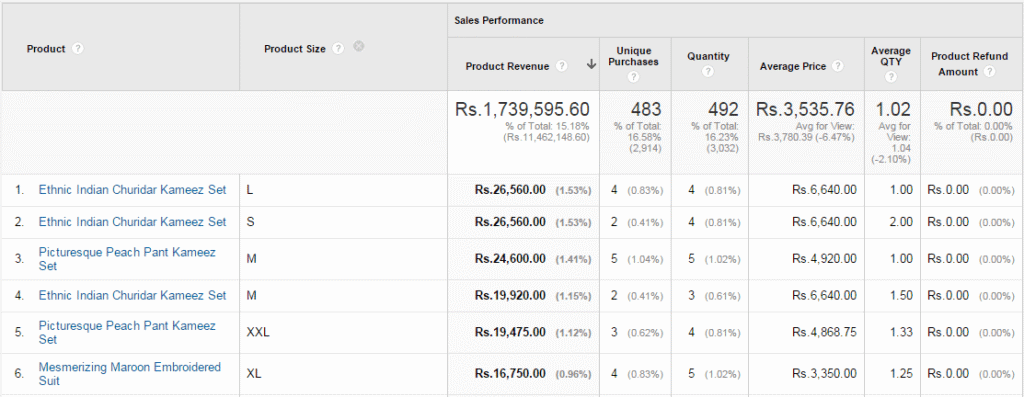
EE Report with Product Size as Secondary Dimension

Google Analytics has come up with a brilliant feature for creating your own custom dimensions and metrics. Custom dimensions are functionally very similar to custom variables, both features enable you to group your data in new ways by applying values to hits based on a scope that you define. However, custom dimensions of Ecommerce are more flexible since it allows you to edit the name and the scope in your property settings without modifying the code.

The introduction of Enhanced Ecommerce in Google Analytics has helped us get detailed product-related metadata information. Earlier we used to have aggregate E-commerce data only in terms of Revenue, Product Purchased, Avg. Price, Transaction, etc. But that’s history now since Enhanced Ecommerce adds dimensions like Brand, Coupon Code, product Variant, etc. in Google Analytics reports that allow us to get important granular level data in Google Analytics. We have covered how these are useful in analysis in our earlier blog post.

Today, we will be describing how to use Google Analytics eCommerce Custom Dimensions & Enhanced Ecommerce to learn which product size & color is popular with your customers.

Product Size and Color data in Google Analytics:

We understand that you have already implemented Enhanced Ecommerce on your store. If your store is WooCommerceMagentoShopify then you can save a good amount of your time in implementing the complex EE code by using our Plug & Play EE extensions.

[Tweet “Implement Enhanced Ecommerce using Free Extensions from Tatvic”]

With the use of custom dimensions, you can get product metadata such as Product Size, Color, review count, review score, etc. information right into Google Analytics.  Follow the steps below to create custom dimension product color & size:

How to create Custom Dimension Product Size & Color?

  • Login into your GA as Admin
  • Click on the Admin Tab & Navigate to the property to which you want to add custom dimensions
  • In the Property column, click Custom Definitions, then click Custom Dimensions
  • Click New Custom Dimension
  • Add a Name (In our Case Product Size & later Product Color)
  • Select Product as Scope
  • Check the Active box to start collecting data and see the dimension in your reports right away
  • Click Create

Product Size & Color Custom DimensionUsing Enhanced E-commerce to Generate Insights:

Enhanced E-commerce reports provide you with product-level data such as Add to cart, Cart to Detail rate, Buy to Detail rate, and Purchases. Now you can combine custom dimension data with EE data to generate the following valuable insights:

[Tweet “Generate Valuable Insights for your Ecommerce Store using Custom Dimensions & Enhanced Ecommerce”]

  • Which is the most popular color for your products?
  • Which color has a higher add-to-cart?
  • Which sizes are the most sought-after sizes for each product and give you high revenue?

EE Report with Product Color as Secondary Dimension(Product Performance Report of EE with Product Color as Secondary Dimension)

EE Report with Product Size as Secondary Dimension

(Product Performance Report of EE with Product Size as Secondary Dimension)

These insights can lead us to follow potential actions:

  • Which product color to promote in a marketing campaign
  • Which color should be used as the product image
  • Which product’s size and color should be pre-stock in a higher quantity

We hope the post helps you understand how you can use Enhanced Ecommerce with Custom Dimensions to discover popular product colors & the size of your store.

How to Use Enhanced Ecommerce of Google Analytics to Measure Product Demand?

Product Demand Analysis Thumbnail


Product Demand Analysis ThumbnailActionability of data is always a concern for all the stakeholders of the company including the business owners, Marketers, Analysts, and Ecommerce product managers.

As I explained in my last blog post, Enhanced Ecommerce in Universal Analytics has opened a whole new world with powerful insights but still, the question remains - what actions business owners can take from these insights to generate more revenue?

One of our eCommerce clients raised the same concern when we implemented Enhanced Ecommerce on his store. The client wanted to analyze the performance of his products in terms of their demand and revenue & use the insights generated to improve their product placements, Marketing efforts, and profit margin.

We then carried out a Product Demand analysis for the client in which we used the Products Performance report of Enhanced Ecommerce to calculate product demand. We combined the product demand with product revenue data we generated several actions which had the potential to optimize the client’s revenue.

(Quick Note: You Might want to check out our Google Analytics Plugin for WooCommerce, Magento & Shopify)

In the following blog post, I will walk you through what is Product Demand Index, How the product Demand index is calculated, and what actions you can take from the analysis.

Quick Navigation:

What is the Product Demand Index?

Customers interact with the product offerings in various ways - Product View, Add To Wishlist, Add To Cart, and Buy.

If we were to understand the demand for each product in our inventory, each of these metrics taken in isolation would give us only an incomplete picture of the demand. But taken cumulatively, we get a more accurate view of demand as represented by customer actions. We call this cumulative metric the Demand Index.

More specifically, the Demand index is defined as a rank given to each product based on various metrics that indicate its popularity such as Pageviews, Add To Carts, Add To Wishlist, and Purchases.

Demand Index= Ratio of PVs to Unique PVs + CTDR + BTDR + Add To Wishlist rate

Where,

  • CTDR= Cart To Detail Rate is the ratio of Add To Carts to Product Detail Views
  • BTDR= Buy To Detail Rate is the ratio of Unique Purchases to Product Detail Views
  • Add To Wishlist Rate= No. of Add To Wishlists/ Product Detail Views

These four data points are collected for each product.

How to arrive at the Product Demand Index?

Arriving at the product demand index is fairly easy and you can calculate the same by following the instructions mentioned in the below 4 steps:

Step 1:

To arrive at Product Demand, first, collect the following data points from the Enhanced Ecommerce product performance report. You need to collect some data points from other reports as well:

  • CTDR
  • BTDR
  • Add To Wishlist Rate
  • Ratio of PV/UPV
Step 2:

Next, add all the above data points to arrive at the product demand Index as shown in the above formula. Now based on their Demand Index give them the Demand Rank. (Higher the Demand Index, Higher the Rank)

Step 3:

To arrive at the sales rank, give each product a Rank based on product revenue metrics. (Higher Product Revenue, Higher the Sales Rank)

Step 4:

Once you complete the above steps, your table will look like this:

Enhanced Ecommerce Product Demand Analysis

* This calculation has been carried out for the Sample data set to show here as an output example

What Insights/ Actions Items You Can Generate from the Product Demand Analysis?

Till now we have seen how you can calculate demand and sales rank for each product based on Enhanced Ecommerce and other analytics data.

But the most important question here is what insights you can generate from this data and what actions you can take from it.

To generate the insights, categorized your products into a 2*2 matrix using Demand and Sales Rank and once you do that following are the set of actions you can take for each of these products:

Demand & Sales 2 by 2 matrix for products

Product with high Demand but low sales

If your products fall in this quadrant, the following actions can be taken:

  • For such products where high demand is not resulting in sales, ecommerce store owners can provide discounts in order to increase the sales
  • Another action that can be taken for such products is to increase the Review score as for most of the e-comm. Much research shows a positive relationship between Product Reviews and Purchases. One such research from iPerceptions shows that 63% of customers are more likely to make a purchase from a site that has user reviews.
  • A High Demand indicates people are browsing the product, adding it to the cart, etc but that is not resulting in a sale so as an advanced analysis we can try to make a funnel for such products and understand where they are dropping off.

Products with high Sales Rank and Low Demand

If your products fall in this quadrant, the following actions can be taken:

  • From the analysis, you can also identify products with high sales rank but lower demand rank. It means that this product if given more exposure can lead to a higher demand rank and to improve the demand rank following actions can be taken
    • Such Products can be placed at prominent positions on the Category Listings so that their CTR increases. Such products can be highlighted via various product listings such as Recommendations

Products with high Demand and Sales Rank

If your products fall in this quadrant, the following actions can be taken:

  • Other actions that can be taken from this analysis are Changing the prices of the products with higher demand and sales rank to achieve a higher profit margin. I know that the price optimization of the products is much more complex but its certainly an option that we can consider

Other Actions

  • Comparing week-by-week performances of products can also lead to several insights and actions
  • For the products for which demand rank is showing a significant decline over the period of a couple of weeks and thus also affecting the sales rank, emails or referral campaigns can be run to improve the exposure

So, this is an overview of Demand Index Analysis through which you can generate actionable insights for your eCommerce store.

I’d highly appreciate your viewpoint on this if you have carried out something similar for your store/client. Also, I am sure that you have already thought about some other metrics that can be included in the Demand Index, please share them and it help us in making the index more meaningful. 🙂

Happy Analyzing!

Interested in learning more about Enhanced Ecommerce? Check out our Post - 32 Resources to Help You Become an Expert at Enhanced Ecommerce

5-Ecommerce Website Analysis Project Reports You Should Use

Shopping Behavior Funnel Report

Google Analytics introduces new features frequently; while some features are a part of an ongoing Enhancement, a few changes the way we look at the data & prove to be Game Changers.

I’d rate the introduction of Enhanced E-commerce in such a category. GA has hit the bull’s eye with the introduction of ‘Enhanced E-commerce. It has opened a cornucopia of powerful insights and actionable data for analysts, marketers, and eCommerce store owners. Enhanced Ecommerce gives a detailed overview of user behavior from landing to final purchase, on the performance of the store’s Products’, Promotional Activities, Discount offers, Search results, drop off in user journey, etc.

In our earlier blog post, Bhoomika showed you how to implement Enhanced Ecommerce on your online store and today I will show you how to generate insights & take business decisions based on the Enhanced eCommerce website project report. I will explain major Enhanced eCommerce analytics reports one by one and give you brief information on what each report brings to the table in terms of insights from data and actionability.

  • E-Commerce Shopping Website Project Report
  • Google Analytics Product Performance Report
  • Internal Promotion Google Analytics Report
  • Internal Site Search Behavior Report
  • Coupon Code Performance Report

(Quick Note:  You Might want to check out our Google Analytics Plugin for WooCommerce, Magento & Shopify)

Google Analytics Shopping Behavior Analysis Report:

The b2b eCommerce Shopping & Checkout behavior report gives you a detailed view of how online users engage with your site after landing on your webpage. Further, it also gives an idea about % drop-offs at every stage of the funnel. It gives you a precise and clear representation of how users progress through various sections of your website.

Shopping Behavior Funnel Report

(Shopping Behavior Report)

Checkout Behavior Funnel Report

(Checkout Behavior Report)

Valuable insights:

  • Which stage of your website is causing high drop-offs and leaking revenue
  •  The behavior pattern of New vs. returning users on your website

New vs. Returning Users

  • Further, you can segment these users based on different dimensions such as medium, device, location, etc

Medium wise Segmentation of users`

Action plan:

This report will help business owners in taking important strategic decisions like:

  • Site optimization on device/platform, wherein some of the stages are highly abandoned
  • Tap revenue leakage from high drop-offs stages
  • Changing the design of high-off stages
  • Bringing users back who had abandoned the checkout process

Google Analytics Product Performance Report:

This report can be considered the most useful addition to Google Analytics. With this report, Google finally fulfilled the demand of eCommerce store owners by adding the most beneficial product-level data in Google Analytics. One can compare the performance of each product according to its purchase, revenue, cart removals, product page views, add-to-carts, cart-to-details rate, and buy-to-detail rate with the help of this report. Each product’s performance can be analyzed and business decisions can be taken based on it.

Product Performance Report

Earlier, a product’s popularity was determined by its quantity and revenue generated by it, but this is not always the same. The reason behind this is that there may be several other products with high product page views, but lesser conversions. With a Product Performance Report one can directly compare products and can carry out product conversion rate analysis.

Brand Performance Report

In the Product Performance section, we can get another important report on ‘Brand Performance’, which lets you compare and analyze each brand’s Sales Performance and shopping behavior data.

Valuable insights:

  • Products/product categories that are getting high visibility among users, but lower visibility to add to carts (ATC).
  • Product/Product categories that are getting removed on a frequent basis from the shopping carts.
  • Brands that are showing better performance and are generating high revenue

Action plan:

  • You can offer discounts on products that have high product view rates but lower add-to-cart rates.
  • You can win back those users who have abandoned the shopping cart using remarketing and thus can improve product revenue
  • Remarketing integration can be carried out with Enhanced Ecommerce which will save you a lot of money as it decreases the dependency factor on Cart recovery tools.
  • Brand performance enables you to take tactical decisions from an investment perspective.
  • Importing product-level data in Google Analytics opens up a whole new level of possibilities
  • And if you can import product-level metadata into GA then it opens up a whole new level of possibilities that as a business owner you always wish to have. Let’s take a few examples-
    • If you can import Product Profit % data into GA and compare product performance data vs. Profit then you can take many strategic decisions such as lowering the selling price of products which is having higher Profit % and lower cart rate
    • You can increase the profit margin for those products which constantly generate high revenue for the store and you can monitor the impact on product performance directly from GA (I know that it’s not as easy as I have written here, that’s why we have built this Price Optimization tool)
    • You can import data on Avg. review scores for products and compare the relation between review scores and product revenue

Internal Promotion Google Analytics Report:

Internal Promotion Report

This report on Enhanced Ecommerce will make marketers’ life much easy. Till now, it was difficult for them to check the accurate performance of internal promotions banners of the store in GA without the need for customization. The best solution for this is to implement event tracking and track clicks on each banner. But kudos to GA as now, with this report one, can track the performance of each of the banners in terms of Impressions, Clicks, CTR, position, and sequence-wise. Learn how to Implement an Internal Promotion Report.

With this report, you can track the performance of each banner in terms of Clicks, impressions, and CTR in terms of position and sequence wise.

Valuable insights:

  • Which of the banner is performing better in terms of CTR
  • How image positioning is actually creating an impact on CTR

Action plan:

  • It proves helpful for marketers in taking certain decisions such as which product should be highlighted on the banner
  • Deciding about the position of the product image in the banner to get a higher CTR
  • Changing the Design & Copy of the banner with lower CTRs

Internal Site Search Behavior Report:

Internal search is a very important functionality to measure the progress of any eCommerce store. Through this report, you will be able to check which products are getting high visibility from search results and is this traffic getting converted or not. It gives you a fair idea about how products are faring in search results. How many times a product appears and its CTR.

Internal Search Behavior Report

This report gives you an overview of how products are faring in search results. How many times product appeared and what is the CTR?

Valuable insights:

  • The most popular products on your eCommerce store.
  • Are people actually getting what they are searching for from search pages?
  • Do products that have high impressions on search pages purchased more often than the rest of the products?

 Action plan:

  • Products with high impressions can be included in the main banner itself
  • Discounts can be offered on products with high search CTR, but low revenue
  • Products/product categories with high search impressions can be highlighted
  • Calibrate the search mechanism on the site if you observe high search impressions for products but low CTR

Coupon Code Performance Report:

This new report in UA now allows eCommerce stores to track the Product or Order coupons that are part of Transactions. It allows the comparison of coupons in terms of Revenue, AOV, and Transactions.

Coupon Performance Report
`

Valuable insights:

Coupons report in UA offers several insights into the popularity of coupons and their impact on stores.

  • Which of your coupon are used most? e.g. - As we can see in the above report, Coupon no. 2 has been used most and with higher AOV
  • Which coupons are generating higher Revenue?
  • Which coupons are impacting AOV the most? e.g.- Coupon no.3 from the above report has a significantly lower AOV than the site average.

Action plan:

Insights into Coupons usage can help you in taking several business decisions

  • Helps you to strategize coupon offers- If you know which coupons are popular and which ones are impacting AOV the most, you can strategize your coupon strategy accordingly.
  • For which products coupons can be awarded more- Analyzing the impact of Product coupons and getting an understanding of how coupons are driving product purchases can help you in selling some of the less popular products and thus increase the revenue.

How much discounts can be offered on products- By analyzing the impact of Coupons on AOV business owners can play with Discount offerings of Products. e.g.- If coupons are impacting AOV negatively, owners can decrease the discount offerings of the coupons

Thus, these reports prove as a boon for eCommerce retailers by providing them with useful insights regarding user behavior in eCommerce stores and action plans which can be taken based upon it. This in turn helps them to take several important decisions to improvise their eCommerce online store and to earn good profits.

Lead Generation Form Analysis - Part II

Lead Gen Form Analysis

In my previous blog post, I explained about why it is important to carry out lead gen form analysis and methodology we used to collect the required data. Here I will give a detailed overview on how we carried out the data analysis stepwise. I have also included list of action items that generated ROI for the client.

Data Analysis

Two most important points you must take into account before starting any analysis:

  • Data of sufficient time frame
  • Define important KPIs that can be segregated further to get meaningful insights.

We have defined three KPIs in our case. These KPIs will act as decision making variables that will help us in evaluating the performance of forms.  Here are the KPIs:

  1. Form view to Conversion Rate: It is the ratio of no. of forms  submitted to unique pageviews of that form page
  2. Form Start Rate: It is the ratio of no. of users who started to fill up form vs. no. of users who viewed the form page
  3. Form Conversion Rate: It is the ratio of no. of users who started to fill up form to no. of users who submitted the form.

Our first step was to find out if any correlation exists between avg. page load time, avg. time on page and exit rate vs. the three KPIs. The only observation found was the inverse relation between avg. time on page and form start rate, which means less and less users started to fill the form as page load time increased?

Lead Gen Forms’ Performance

KPIs Values: Lead Gen Form analysisWe carried out analysis at the Macro level by calculating the KPI: form view to conversion rate. In this case we observed this rate as 15% (which means only 15 out of 100 who visited the page, submitted the form). Now moving towards Micro level, we identified 22% form start rate. Next question was how many of them actually submitted the form after starting to fill it. And Form conversion rate for the site was observed to be 80%. These observations gave us clear overview of how users actually interacted with the form.

On digging further, we observed the placement and orientation of forms and checked whether it affected our KPIs or not.

Orientation of Forms vs. KPIs

Orientation vs. Form Start Rate & Form Conversion RateWe observed that when comparing the form start rate, the forms which are right aligned or are on right hand side of the page tend to have 31% form start rate vs. 22% for forms which have central orientation (as shown in Graph 1). It suggests that the general tendency of the user is to start filling forms which are on right hand side on the page.

Moreover, we also found that orientation of the forms affected the form conversion rate. As the forms which were right aligned had 15% higher conversion rate than the ones which were center aligned.

 Placement of the Forms vs. KPIs


To categorize the forms further, we checked how placement of the form affected the KPIs. From the analysis we found that forms which were placed Above the Fold (ATF) have 29% Form Start Rate vs. 3% for the forms below The Fold (BTF) (as shown in Graph 2). This clearly shows that users are not able to identify the form by scrolling down the page.

Effect of Form Length on KPIs

We also looked out for any correlation that may exist between no. of form fields, form start rate & form conversion rate. Start rate for the forms decreased significantly as no. of fields increases which indicates that form length is directly affecting the user’ s decisions (as shown in Graph 3). But on the other hand, form length doesn’t affect the form conversion rate, which is against the common belief that user likes to fill the forms which are shorter.

Analysis of Form Fields

In the next step, we studied the behavior of each form field to identify if certain field causes significant drops and check if optional fields can be removed. And our hypothesis is proved valid when we observe that certain form fields that were causing large exits from the form and that demanded attention & action.

In one form, ‘No. of Employees’ field had caused a drop-off of 20% (whopping! isn’t it??). It means, 20 out of every 100 visitors were abandoning the form after reaching this field. The same field in another form caused a drop off of 11%. This clearly shows that there is an issue with this field due to which user are abandoning the forms.

Looking at the data of the forms, we also find that presence of the side bar links on the form pages cause severe distraction as approx. 30% of users abandoned the form pages by clicking on sidebar links.  This is an important observation as site owners tend to put many links on the form pages without knowing its implications.

Assigning $ values to lead submission

This analysis brought forth some important observations. But what about economic impact this analysis generates? Simple insights and data points are not sufficient to convince any stake holder in terms of how much revenue benefit the analytics will generate. The most important aspect of any this analysis is that it should generate significant ROI for the client.  So, in this analysis we assigned lead values to each form based on its impact on the business. We used this lead values to calculate revenue benefits that were generated from each form submission and found the revenue leakage due to form field abandonment. By this way, we can directly attribute our observations with the revenue loss incurred.

For e.g.: For one form, 2500 visitors started form filling and 2100 visitors submitted the form. With the lead value of the form being $1000, revenue leakage due to 400 abandons resulted in $400,000 loss (Shocking!!). This is just for one form and when we calculated the same for all forms, we found revenue leakage caused due to form abandonment in Thousands of Dollars(Just Imagine!!) and how much revenue leakage can be contained from the analysis will help generate ROI.

Action Items from Analysis:

From this analysis, it appears that there are lots of opportunities where we can contain revenue leakage that occurs due to drop of visitors from the lead gen forms. The most important action items we get from the analysis is developing several ideas for A/B tests based on the observations. To generate test ideas we also took into account the best practices for form field. Some of these are:

  • Changing the placement and orientation of the forms
  • Removing the forms fields which are causing extra ordinary drop offs
  • Changing the input method of fields
  • Removing the sidebar links from the form pages
  • Removing the top menu from the form pages
  • Keeping the name of the form field above it

Another action item that was derived from the analysis was the creation of Re-marketing list of the users who had abandoned the form after starting to fill it.

This analysis proved to be very insightful and it will continue to do so due to the sheer impact it can cause on revenue. I hope this blog post can help you in carrying out analysis on your own.

Do you want us to carry out similar analysis on your website? Get in touch with us.

Quick Steps To Recover Deleted Google Analytics Profile/Account

Deleted GA Account

In the last few weeks we have received a no. of queries from Google Analytics (GA) users asking for help in recovering their deleted GA account. Some of them even lost their GA accounts’ log in credentials and now are no longer able to access their “Precious” account. These queries prompted me write down this literature which can provide users guidelines on how to regain the access of deleted GA account.

The issues faced by the users can be classified into three categories.

  1. GA account is accidently deleted  by the user

  2. GA view accidently deleted by user

  3. GA account access is revoked. Here the user looses the ‘Managed User and Edit’ access.

Before I begin let me assure you that if you fall in any of the above category, all is not lost. Your ‘precious’ data is still recoverable. Let me explain in detail how you can recover access to your deleted GA Account/View

If Your Account Is Linked To Adwords

If you are using Google Adwords and if it is linked to your GA account than the process of recovery becomes very easy. You just need to follow simple steps as mentioned below:

  1. Log in to your Adwords account
  2. Go to Adwords Support and ask for help on Google Analytics. Here you can contact Google support via Phone or email
  3. You need to send some information to Google regarding your GA account.
    • GA Account (X) and Web Property (Y) (UA-XXXX-YY)
    • Login Email Address(For the email address experiencing the issue)
    • The web site domain
    • Date of deletion of your Account/Profile
    • GA Account/View Name(Required for Account/View Recovery respectively)
    • In addition to this, you also need your Adwords account number
  4. Send request to Google support team

Google will verify your information and will grant you access within few days, but however there is no guarantee of it.

2. If Your Account Is Not Linked To Adwords

Don’t worry if you are not using Adwords. You need to contact any GACP partner and they will put forward account restoration request on your behalf. Only thing they need from you is information that is mentioned above in Step 3. You can contact GACP partners even if you are using Adwords and wants help from experts.

And it so happens that you are not a GACP partner, we can help you get in touch for the required help. Feel free contact us anytime via email or phone in case you have lost access to your GA account/profile .

But as wise man once said “Prevention Is Always Better Than Cure”, you can always take following steps so that you don’t run in to such trouble:

  • First and foremost, avoid sharing GA access to personal email ids (gmails, yahoos) of company’s employees. Always make sure that you give access to employees on official ids so that your company has full control.

  • Among all the request we got from GA users to regain GA access, one thing that stood out is that all these companies did not revoke the GA access of employees after they left the company. In all such cases someone had deleted the admin access. So always make sure that once any employee leaves your company, you revoke GA access from his/her email id.

  • Share ‘Admin’ access to only those users who actually need it. All other should be given ‘View’ only access.

I hope that this blog post help you in recovering your GA account. But please make sure that you contact Google or GACP partner-

  • Within 14 days from the date of your account deletion, if your GA account has been deleted

  • Within 90 days from the date of View deletion if any of your View is deleted.

Once that time period has lapsed, there are very less chances that you can recover your account. So please act swiftly.

Lead Generation form Analysis Guide using Google Analytics

leads in GA

leads in GA

If you are in B2B business the best way to check the performance of your site is to check how many leads it generates. But it is not at all easy for any lead gen sites to convert visitors in to leads and get business. To attract more visitors and generate potential leads you invest heavily in the appearance of your website, hire best developers and use best web site technologies. And still, you find that you are not generating enough leads to grow your business. Its because sometimes business owners ignore one very important part of the web site, which is lead gen forms. Lead gen forms are one of the prime way to grow your business. That’s why as a B2B site owner, it is imperative to check the performance of the lead gen forms.

Pic1

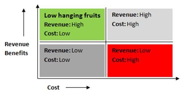
Another reason why it is advisable to check the performance of forms and fix the issues is that leads gen forms are ‘Low hanging fruits’ for the business. ‘Low hanging fruits’ are those opportunities for business where you achieve high ROI without incurring much cost. Lead gens forms belong to this category due to the impact it can cause on the revenue. Benefits derived from optimization of forms can yield great financial benefits to the business as it can directly impact the no. of leads submitted. But question is how to check the performance of the forms using form field analysis.

In this blog post i am sharing with you one interesting case study of the lead gen forms’ analysis that we have carried out for one of our client. I will now try to to lay down the road map in a simple and systematic manner so that it will become easier to understand and execute as well. I hope that this blog post will give you a clear idea on how to check the performance of your lead gen forms.

Objective of the analysis

Our objective behind carrying out this analysis is to identify if there are any anomalies in forms fields or forms positioning that is leading to extra-ordinary drop-off rate during the form filling process. Along with it we also want to understand whether it is required to restructure the order of certain set of forms to have them understandable & easy to navigate to ensure higher form fill up rate.

Data collection/Methodology

To carry out any analysis it is utmost important to gather right data. It was not possible for us to get the data required to carry out this analysis in GA so we implemented advanced tracking mechanism to track all the necessary data points. Implementation of tracking was easier for us as we already had GTM implemented on the client’s site. GTM made all the tagging easier. If you wish to carry out this analysis after reading this blog post, I would strongly suggest you to implement GTM as it will make your dev. team’s life much smoother. (Here is a blog post on why I love GTM)

Now, since GTM was implemented, we customized JavaScript to track different steps (fields of forms) using virtual page views in Google Analytics. Virtual Pageviews get fired whenever user completes any field and moves to the next field or perform any other action. This implementation ensures that we track the interaction of user with each form field.

pic2

Using virtual page views, we built different funnels for each form to learn the number of users starting the funnel & understanding users’ abandonment at different forms fields. We created funnel goal for each form and ensured that funnel steps match the sequence of fields in the form. It ensures that we track the user flow from the first field of the form to form submission. One example of such funnel is shown here. This funnel shows the no. of users abandoned the form from each field. In this figure, the steps of the funnel describes the name of the form fields and no. on the RHS describes no. of users who abandoned the form from each field.

We also collected data of form positioning on different pages, no. of fields in forms, no. of errors occurring while filling the form, no. of visits distracted towards form sidebar links.

At the page level we considered Pageviews, Avg. page load time, avg. time on page and exit rate as primary set of dimensions and metrics which give us clear idea on the form pages.

So this was about what data points needs to be collected to carry out this analysis. I have divided this blog post in to two parts. In the second part, I will explain about how we carried out data analysis and set of action items that has generated from this analysis.

(Part 2: Lead gen form Analysis using Google Analytics)


Bot Icon
Bot Icon

Tatvic Bot

Explore About Tatvic and Services