Hello There!

Lorem ipsum dolor sit amet, consectetur adipiscing elit,

UX tips to improve Contact us page engagement and conversion

In the online world attention is the currency. A business website, therefore, cannot ask the visitor to pay extra attention to find the company’s contact information. If not created right, the contact us page could lose potential business.

The page certainly deserves more attention while designing it. So your potential client doesn’t have to search too hard to reach out and connect. The relevant information should be upfront, concise, and easy to access.

Here are a few UX fundamentals to improve the user experience.  

1.Contact form essentials

Place the form above the fold. So it is visible to the visitor immediately on arrival. Also, fewer fields will have more form fill-ups. Name, Email, the Business query is what you need to start with. An optional phone number may be. It’s better to point out the mandatory fields with an asterisk * sign.

A successful submission, form validation, and an error message will reduce the spam records If you do have multiple sections, save and submit each section. Highlight the active field that helps users to navigate throughout the form

Don’t

  • No popups. It may divert the user’s attention while submitting the form
  • Multiple dropdowns. It will increase the form drop-offs.

Please remember, website visitors are more likely to fill short and simple forms instead of complex forms.

2. Messages and personality

A big Hello, Join us, Get in touch, Happy to Help, are a few good phrases to start the conversation. Reflect your brand personality that will make the user feel more welcomed and cared for.  

What to expect next. A message after successful form submission triggers a sense of accomplishment. The message what to expect next, in what timeframe improves user experience manyfold. You can send a short email with links to content on your expertise, authority, and trust, as an option.

Don’t 

Do not overload your page with useless or irrelevant text & images. Remember, a confused mind always says no.

3. Postal Address. Store address  

Traditional stores shown with google pin will immediately add actionable information.

 For B2B, mentioning the physical address of offices with phone numbers and postal codes helps the user plan a trip or send a courier. It even builds trust. If you have multiple locations, having a store/branch locator functionality over this page helps.

Don’t

Leave old addresses and contact information on the contact page. It shows carelessness and lack of attention to details.

4.  Be real and relevant with images

A relevant image of your services/ products can communicate your business objectives and value proposition with visitors. Use real people’s faces and team members to connect well. Analyst of NN Group found that users pay more attention to the real person’s photographs and other relevant images.

Don’t 

Stock images to show team members are strictly a non-starter.

5. Social media connect

Social media links on your contact us page will give the user an option to know more and interact with your social pages. The importance of social media links cannot be emphasized more.

It helps create a sense of community, earns trust, and an easy 24×7 support access across the geographies.

Don’t 
A broken link is detrimental in earning trust, not to say a lost opportunity to build community.

6. Interactive contact numbers and help/support Email IDs

Direct contact numbers to customer-facing team members and Email addresses can improve accessibility and leads.

An interactive chatbot, access to FAQs can improve action and interactivity. If you want to reduce the user’s efforts, make this information interactive. Thereafter users can contact you with just 1-click on the contact number and email IDs.

7. Call to action buttons

Direct contact numbers to customer-facing team members and Email addresses can improve accessibility and lContact form without a submit button is not possible. What CTA we define also affects the click rate. The buttons are the difference between a win and loss. So we better fix them. The idea is to improve the language on the button to project the benefit to the user, after clicking the submit button.

Here are options that you can use for better conversion of the contact us page :

  • Submit to connect
  • Send query now
  • Get started now
  • Free Consultation
  • Talk to us
  • Get free Demo
  • Begin inquiry
  • Get Quote
  • Get a callback
  • I’m interested in
  • Let’s have coffee!
  • Let’s connect

8.  Add an interactive Map of your locations

Businesses that have traditional stores/offices must have an interactive map that helps users to reach the store easily. Google Maps is the best option to add interactive maps to your page. It also helps the corporate offices to demonstrate their availability of multiple locations.

9. SEO for Contact Us page

It is not a surprise that the importance of a contact us page underlines search engine optimization. Modern day practice is to instinctively use search engines for any query and information. Supplying your access information to help users identify where your office or store is located and how to get in touch is non-negotiable.  

So it’s only natural to make this information accessible to customers without even visiting your website. Search engines like google and bing have made this possible. Search Engines allow businesses to include their contact information in search results. And supply detailed instructions on how to connect and reach.

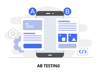
One bonus tip is with regard to A/B testing. The testing helps determine if our choices really are improving the user experience. A/B testing shows two or more variants to a set of users, based on the behaviour and responses a choice is made. Check how one of Tatvic’s clients Angel Broking gained 53.5% more leads after A/B testing results guided them to change the colour of their CTA.

We are here to help. 

Whether you’re an SME or a large enterprise, customer experience is your goal. It is important that we help the user as deeply as possible. Even before they turn into clients or customers. The opportunity to leave the right impression is key.  

A good Contact Us page would bring a lot of traction and nudge your customer to take the required action. Book your slot for free Conversion Rate Optimization Assessment here.
12 UX Tips to Improve & Increase Conversion Rate (CVR)


Good User Experience means a user-friendly interface that ensures that the user reaches their final goal on a website/app or a system with ease. Each little element, however minor, when placed on an interface comes together and plays a role in converting the users. Together all these elements own the user experience of the product.

Following are 12 UX tips that help in improving user experience and further increase conversion rate.

1. CTA (Call To Action) Button Design & Placement

Where you place your call to action greatly influences your customers’ UX. If CTAs are hard to see, read or click, then that has a negative impact on UX and conversions. The goal of many pages is to sell something-whether products, subscriptions, or signups. CTAs are integral to conversions and so is their placement.

There’s a lot of fuss around the internet about the significance of colour when it comes to influencing buyer’s behaviour. It’s commonly believed that green CTA buttons are more effective than red ones because green is usually perceived as ‘go’ and red as ‘stop’. Although there is some truth to this, a brand’s colour scheme definitely influences perception, but when it comes to conversion, colour doesn’t matter as much. What really matters is contrast and visibility.

CTA copy is a vital element of conversion optimization. Companies often forget to pay attention to what their CTA headlines and buttons say. How many times have you seen a button at the bottom of a page that simply says “Submit”? While this may be appropriate in some circumstances, CTA buttons and headlines provide a massive opportunity to increase conversion through a great copy.

Headlines that are particularly effective tend to include words that elicit emotion, create a sense of urgency and demonstrate scarcity. Why? Because a CTA written in this way will make your on-the-fence users (often a majority of your total users) most likely to pull the trigger and convert. When it comes to providing a quality user experience to visitors, call-to-action (CTA) buttons play a major role. Conversion, engagement, business, revenue, and profits of your business solely depend on the call-to-action button you provide throughout your website.

CTA along with specific colours can be a game-changer. Studies prove that CTA buttons with orange, red and green colours are more likely to be clicked by the visitors.

2. Quick Page Load Time

Today, more than ever, site speed is one of the most crucial determining factors in whether your UX is up to par or not.

Sites that are noticeably slower suffer from conversion losses compared to sites that are blazingly fast.

How do you know what’s fast enough, though? A classic study conducted in 2009 by content delivery network provider Akamai and Forrester revealed that 40% of consumers refuse to wait longer than three seconds for a page to render before they abandon the site. If your site takes three-and-a-half or four seconds to load, then poof. Your leads vanish along with your conversions.

A much newer study done in 2016 by DoubleClick by Google confirmed these earlier findings. When it comes to mobile, if pages take longer than three seconds to load, then 53% of mobile site visits are abandoned. Like mentioned earlier, you just have 3-5 seconds to impress a visitor. But if your website takes 10 seconds to load, then obviously, the customer would get frustrated waiting and look for some other site (mostly your competitors).

So, to give a great user experience to your visitors, it’s essential to have a well-optimized website.

3. Use High Quality & Original Photos

Images instantly lift up any webpage and make the content visually appealing. But, the type of your chosen image can make the overall design of the page appear good or bad.

It’s best to stick to this rule - Stay away from stock photos. While it is cheap and extremely easy to use stock photos it does more harm than good.

Stock images might look professional, but, within no time the users would be able to identify stock images and lose interest.

Original photos draw more visitors as they have a realistic approach to them and the user connects with them. Whereas stock images are overused and don’t create an appeal.

One more thing to be kept in mind is that using stock photos sends across a message that you have not invested much effort in designing the website. Also, it doesn’t look unique as they might have already seen it somewhere else.

So, always use authentic images, no matter how basic and simple they might look. Remember to stay away from stock photos

4. Content (Text) Visibility & Optimization

Consider the reality that your leads and visitors don’t actually read much of the copy on your site. According to UX Myths, people usually just skim site content. With short attention spans, it’s crucial that whatever little content they read is actually easy to read and interpret. If your copy isn’t comprehensible enough, they won’t know what to do.

What if I tell you white space or negative space of your website helps you to achieve a great website design. Yes, that’s true! In spite of being one of the most important aspects of website design, it’s still so underrated.

According to research, white space around text and titles increase user attention and provides a better user experience. White spaces make your content more legible and easy to navigate. However, you need to balance the use of white spaces with important information. It is proven that White Space increases click-through rates, as it allows the viewers to read/scan any data on a web page without the background clutter.

Therefore, keeping adequate ‘White Space’ on a website actually generates more leads and improves a merchant site’s conversion rate.

5. Easy and clear steps to check-out

Easy and clear steps to check-out

There’s a lot of debate among CROs on whether single-page or multi-page checkouts are better to convert. The truth is that there is no absolute answer to this question. In some cases, a single-page checkout process works well. In others, a multi-page checkout will do better.

For E-Commerce, it’s mandatory to reduce the steps of the checkout process. Most retailers, however, stick to a multi-page checkout process and never even try to experiment with a single-page alternative.

6. Guest Login works wonders

Guest Login Works Wonders

Your customers today are wary of sharing their private information with your site. They may like your products enough to buy them, but only a few of them would want to create an account and start a relationship with you. Yet, so many e-commerce stores continue to push mandatory sign-ups onto users. This has a disastrous impact on conversion rates since customers would rather skip buying altogether than deal with newsletters, promotional offers, and upsells.

Create a user account automatically when they make a purchase, assign a random password and send the information with the order receipt in their mailbox. Even if users choose not to register, you still want them to buy your products or services.

So do not force a sign-up on the checkout page.

7. Right duration of Animation or Transition

Animation draws the attention of users and it can control where they focus. This is great as long as the user is focusing on the right thing.

Animation at a wrong place and at wrong speed, becomes a distraction front the content. 

When elements change their state or position, the duration of the animation should be slow enough to give users the possibility to notice the change, but at the same time quick enough to not cause waiting.

Among the moving objects of the same size, the first one to stop should be the object that has passed the shortest distance. Small objects in comparison with large objects should be moving slower since they make bigger offsets.

8. Avoid Bouncing and Motion blur effect in Animation

Animation is important because it enables us to tell stories and communicate emotions and ideas in a unique, easy-to-perceived way that both small children and adults can understand. Animation has helped to connect people throughout the world in a way that sometimes writing and live-action films cannot.

When objects collide, the energy of collision must be evenly distributed between them according to physical laws. So, it’s better to exclude the bounce effect. Use it only in exceptional cases when it makes sense.

The movement of the objects should be clear and sharp so do not use motion blur. It is difficult to reproduce the effect even on modern mobile devices and it’s not used in interface animation at all.

9. Use Easing effect instead of linear for animation

Easing helps to make the movement of the object more natural. For the animation to not look mechanical and artificial, the object should move with some acceleration or deceleration - just like all live objects in the physical world

Animation with easing looks more natural compared to the linear one.

10. Proper navigation throughout the site (Sitemap)

A recent online survey revealed that improving a website’s navigation may increase the conversion rate by 18.5%. Your website may stand out amidst the crowd of thousands of other merchant sites catering to similar services/products. However, you may lose a large number of potential clients if they experience difficulty navigating through your website and leave the site.

If your visitors are unable to use the website and navigate around to find what they are looking for; you lose the game and that’s a big NO.

Clean and simple navigation makes it easy for users to quickly locate what they need. So, here’s the idea: Think of what customers would look for on your site most frequently. Then make them visible. When potential customers look for something on your site but find it difficult to locate, they would be frustrated and would go away, probably straight to your competitor’s site.

11. Have Consistent colour palettes according to the branding.

If you’re designing a landing page or any page, you need to restrict your colour palette according to your brand. Too many colours can create a distraction and your user won’t know where to focus and give their attention.

When you limit your colour choice to just one or two but make use of their respective shades and hues, you’ll be able to create a design that is more balanced. As we said, colours are like emotions. Too many colours on a page and you’re going to overwhelm anybody who visits your website.

A good tip, stolen from the world of interior design, is to use the 60-30-10 rule. 60% is your main colour, 30% is your secondary colour and 10% is your accent colour.

It isn’t always the case that your UI colour has to align with the brand identity but it’s a good way to promote consistency in the UX design and improve overall recognizability.

12. Create Autocomplete and Search suggestion functionality

Create Autocomplete and Search suggestion functionality

As users type, does your site search give them drop-down or autocomplete suggestions? These techniques can help your users find relevant search terms as well as reducing the time and key-strokes needed to execute a search. Users love it when the tasks they have to perform are made easier.

Autocomplete search allows users to click on suggestions and be taken directly to search results, thus decreasing the time needed to search.

The instant feedback given by autocompleting can help improve the overall user experience on the site, leading users to find what they need and convert faster.

By producing the keyword suggestions that are known to produce relevant results, the autocomplete feature considerably expands the likelihood of successful searches on the first try.

7-Web & Landing Page Design Hacks to boost Conversions

When it comes to digital marketing, the first question that comes to mind is how it can increase landing page views. 

And the second biggest concern that bothers everyone is the connection between the landing page and the creative. 

If you also get worried and stressed out by thinking the same questions, we can help you get through it. Here are seven hacks that can get you a top-performing landing page in no time. After implementing these tips, you can work with a website design company in Seattle to further optimize your landing page for conversions.

We will unravel the mystery of these seven hacks one by one so you can easily understand the role these play in your digital marketing campaign of driving more conversions through landing pages. We’ll also discuss why you must consider using landing page optimization services to fine-tune performance and maximize impact.

Top 7 Design Hacks For The Landing Page To Help Increase Conversion:

Here we have listed a few simple optimization hacks for the landing page that are easy to implement and help drive conversions.

  1. Make Sure The Landing Page Connects With Your Ads.
  2. Keep Your Call To Action Above The Fold.
  3. Use The Principles Of Persuasion To Influence The Users To Click.
  4. Showcase The Product/Service Value.
  5. A/B Test Your Landing Page.
  6. Make Sure The Landing Page Loads Fast And Is Simple To Understand.
  7. Give Personalized Offers For The Prospects/Customers. 

1) Make Sure It Connects With Your Ads:

  1. You need to understand that you are sending people to a landing page that should match visitor expectations. Make sure your copy, imagery(design), and offers are the exact match of the Ads that you’re running on social media, Google ads, or any other platform.
  2. When running many landing page optimization campaigns with different headlines and messaging, you need to create variant pages with Dynamic Text Replacement and ensure the message matches.

2) Keep Your Call To Action Above The Fold:

  • Keeping the CTA above the fold means positioning it in the upper half of a web page and visible without scrolling down the page.
  • By placing our Call to action above the fold, CTA is more visible to the user before scrolling down, and it will generate more clicks.
  • Make sure that the user can easily understand the action item for that landing page.
  • You can showcase more information about the products/services after scrolling down, but as a general rule of thumb, the headline, main messaging/offer, and CTA should always be above the fold.

3) Use The Principle Of Persuasion That Will Influence Users To Click:

  • You can use the Principles Of Persuasion for messaging on the landing page.
  • By using the Authority Principle, you can build trust for that product/service. People are more likely to trust brands who are having some Achievement or are Authority figures.
  • By using Social Proof, you can showcase the review and ratings for the product/service. Testimonials are the most effective form of social proof and help get a conversion.
  • Using the Scarcity principle, you can create urgency to get more clicks.
  • Scarcity compels the landing page visitors to act now. And they might miss out if they wait.

4) Showcase The Value For That Product/Service:

  • On the landing page, you can show what value that product/service brings to the customer. It will increase their interest in your product/service.
  • Show the value you give to the customers. Whether it’s a discount or customer support, show that on the landing page.
  • If products/services help the customer by reducing their efforts or anxiety, or cost then we can highlight that on the landing page.
  • By giving and displaying value to the customer we can build customer loyalty to our product/service.

5)  A/B Test Your Landing Page:

  • Different elements on the landing page convey a message to the customer about what values we are giving them and how it helps them.
  • Visual elements, Text, and color of the Call to action, Headline, CTA Placement, and User Details Form help to convert a lead.
  • You can A/B test the landing page and create multiple variants of different messaging, CTA Text, CTA placement, Layout, User form input fields, and Images versus Videos, to see what works best for your campaign.

6) Keep The Landing Page Fast To Load And Simple To Understand:

  • In this Digital age, Quick load time has become an expectation of every user. As per Hubspot, 55% of Visitors spend fewer than 15 seconds on any website. These stats are enough to confirm the importance of quick load time for your landing page. 
  • Slower-loading of landing pages will result in lesser conversions. For example, people are less likely to purchase any products from eCommerce websites with slow landing pages and even less likely to visit that page again in the future.
  • To increase your conversion rate, you need to make sure that your landing page loads fast enough.
  • Keep the landing page simple, don’t display too many things that confuse your customers. Make it straightforward with your offerings/promotions.

7) Personalized Offer For The Prospect:

  • You can personalize the landing page for prospects to increase conversions. (A prospect is someone who can be your potential customer, qualified to fit certain criteria), is in your target market, can buy your product or services, and is authorized to make buying decisions.
  • Personalized landing pages mean you can showcase to the customer the promotional offers are exclusively for them only.
Bot Icon
Bot Icon

Tatvic Bot

Explore About Tatvic and Services