Hello There!

Lorem ipsum dolor sit amet, consectetur adipiscing elit,

 About Bismayy Mohapatra

Bismayy is a Product Manager at Tatvic. He has developed Badger, an intelligent insights generation engine powered by Machine Learning. He is working with team to develop PredictN, an automated prediction SaaS platform for businesses to boost their marketing RoI. He applies R, Python, Cloud Prediction models to help clients make sense of their digital analytics data. He loves playing and following football.

Analytics, Landing Page optimization - Help! Help!

Launching Help.

After launching Excel Plug-ins for Google Analytics And Google Adwords, and helping a number of Businesses around the world improve their Conversions / Sales / Revenues, we are confident that we can solve really difficult problems. 🙂

So launching Help. We want to help everyone who finds problems on regular basis by optimizing their sites.

Send any queries/problems/hiccups you find regarding these topics and we’ll answer them:

1. Google analytics - implementation, optimization, reporting, data processing, features :), support

2. Landing pages / Websites - optimization, improvement, elements (call-to-action, headlines), a/b tests, multivariate tests!

3. Dashboards: We are building a series of dashboards including much-awaited features in our excel plug-ins (e.g. data from AdSense, Twitter, and Facebook in excel). We would love to hear from you about what you want !!

Send your queries through any of these mediums:

Twitter: send as tweets to @tatvic, use the #th tag(Tatvic help). Follow us on Twitter.

Facebook: Good option if your question can’t fit in 140 characters or you have any attachments. Join us on Facebook.

Looking forward to queries / problems / suggestions / comments.

Thanks.

Fresh Look at Multi Channel Funnels of Google Analytics Version 5

Multi Channel Funnel Path Length Report

It’s been a few months since Google Analytics got a makeover and everyone’s enjoying the new look with improved usability. There are a lot of new and improved features we’ve had since then.

We couldn’t resist writing about the latest feature.

Multi-Channel Funnels

As a web analytics consulting firm, it had been imperative for us to be able to communicate how different acquisition sources interact with each other and how to look at them in a sequencing view of them.

This is the very latest feature added by Google in GA version 5. Till now, you knew which of your marketing channels are contributing to the total conversions, with numbers. Google Analytics showed you only the last traffic source, which contributed to sales. But it’s not the case every time. The customers might have seen an ad on Facebook or Google, clicked on it but didn’t buy. After 15 days, they visited the website directly and purchased. The credit for conversion will go to Direct visits. But that’s not the case now. With Multichannel funnels in Google Analytics, you’ll be able to know which was the initial source of visitors for your final conversion. It shows you how people traveled through your different marketing channels to make purchases. It’s an eye-opener for marketers who spend a lot on marketing campaigns. They’ll know which marketing channels are actually contributing to the sales.
The multichannel funnel provides four important reports, which give great insights to help you optimize marketing campaigns.

Here are the Reports this feature provides:

1. Path length Report:

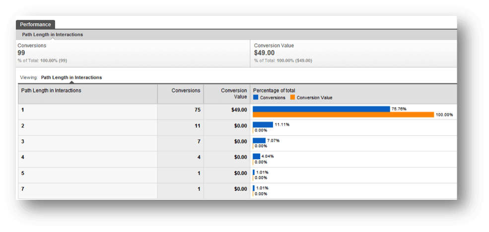
Multi Channel Funnel Path Length Report

This report shows you a number of channel interactions your customers had before making the purchase. You can know whether the path with 2 or 3-channel interactions is working better for you.

2. Time Lag Report:

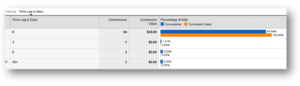
The Time Lag report looks similar to the Path length report, but this one tells you how long your customers take from the first channel interaction to conversion.

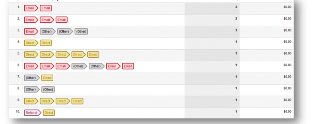
3. Top Path Report

Multi Channel Funnel Top Path Report

It gives you the top routes your customers took before conversion. It also tells you how your channels and in which order, are converted for you.

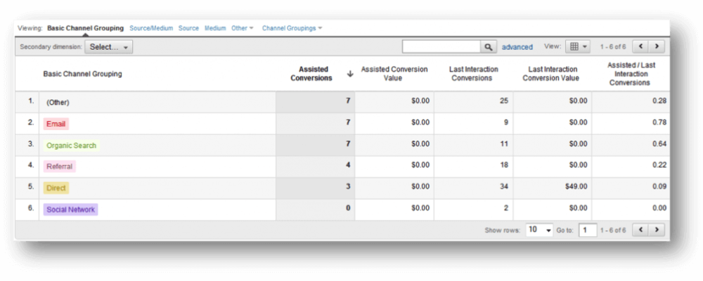
4. Assisted Conversions Report

This one tells you an additional number of conversions your channel is involved in.

So this was about Multi-Channel Funnels. Here are other important features that are around since the new look. It’s now easier to get important analyses of your business.

Like this, people at Google Analytics keep adding new features to make our life more and simpler and get better business insights. Waiting eagerly for more exciting additions like this.

How to Add Google Analytics to Joomla? GA Implementation Guide.

Joomla

Joomla is a Free and open CMS (Conetent management system). It’s one of the most popular CMS amongst WordPress, Drupal and many others.Since Joomla CMS has been downloaded 23 million times, there are fair chances that a lot of people who use a CMS might be using Joomla.

Implementing Google analytics with Joomla!

The purpose of this blog post is to make Joomla users understand the importance of Google Analytics implementation on Joomla websites. There are two ways you can implement Google Analytics on your Joomla enabled website.

  1. Manual implementation
  2. Using extensions
    1. Manual implementation: When you are using a CMS, it becomes easy to manage and enhance features. In a non-CMS website, you have to add Google Analytics codes manually on each pages. In a Joomla website, you just have to paste the code to your main template page, and it gets added to all other pages of the website.

      Steps

      1. Log-in to your Joomla account.
      2. Go to Template manager from Extension menu
      3. Select the default template, click edit. On the edit page, click Edit HTML.
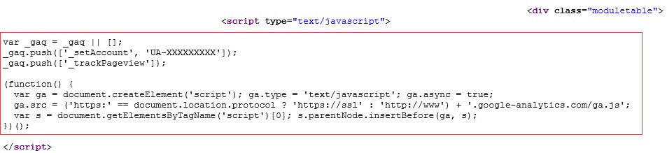
      4. Paste your Google Analytics code in the <head> tag and click Save. It will add the code to all other pages of your website.


  1. Using extensions: Extensions in Joomla are like add-ons. They are also called modules or plug-ins. Extensions are ready made features for your Joomla website. E.g., a Google plus extension adds Plus 1 button to your website with a few clicks. There are more than 7,400 extensions available on official Joomla! Extensions directory, and many more are available otherwise. From this huge list, there are a lot of extensions available for Google Analytics implementation.

Here are some of very popular Google Analytics extensions we found.

  • J! Analytics
  • OpenPotion
  • Bigshot
  • Asynchronous Google Analytics
  • Google Analytics plugin for Joomla 1.6
  • iBualoy Analytics
  • WebGuru’s Google Analytics
  • AS Google Analytics

Out of these extensions, we found the J! Analytics Extension cool, and it’s very popular amongst its competitors. It’s also available for the latest Joomla version, 1.6.

Here’s how you can install J! Analytics extension on your Joomla website.

    1. Download the J! analytics extension from the Joomla Extensions directory.
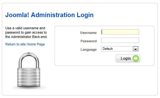
    2. Log-in to your Joomla admin account.
    1. From main menu, click Extensions > Install/Uninstall

    1. Browse the file and install it.


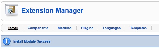
You’ll see a notification once the installation is complete.

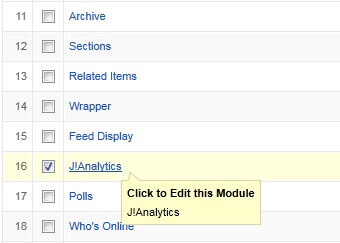
    1. Go to Module Manager and click on J!Analytics to edit it.

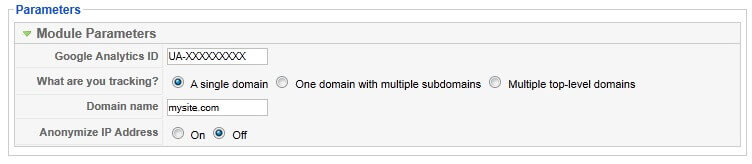
    1. Make necessary configuration changes as shown in the screenshot below.

On the right side of the same page, enter values as below.


Click Save once you’re done.

    1. Done. This will paste Google Analytics code to all of your pages. Open any page of your website and see whether the code exists in the source.

It’s this easy to install Google Analytics code to your website. This was for J!Analytics. For other extensions mentioned above in the list, We recommend the automatic installation over manual code pasting. Why?

  1. For non-techie users, it’s the best option. Just a few clicks and settings, and over
  2. It’s likely to make mistakes while going the manual way
  3. These Extensions are free, why not use them?

Google Analytics Implementation for Joomla! VirtueMart

If you are running an e-store on your Joomla enabled website, most probably you are using VirtueMart as your Shopping Cart Application, and it must reflect in your Google Analytics profile properly. e.g., it should show revenue numbers for each product, and show how each product is performing.

It’s important to use an extension for e-commerce tracking while you are using Joomla with VirtueMart. Again, there are a lot of options available in the Extensions directory. We installed JAnalytics and these are the steps to follow.

  1. Download the J Analytics plugin from Extensions directory.
  2. From main menu, click Extensions > Plugin manager
  3. Go to plugin manager and click on “janalytics virturemart” to edit it.
  4. Follow step 6 from above example.
  5. Done. Now, open the order confirmation page source of any successful transaction look whether transaction details are being passed properly. Check the screenshot below.

Done. Isn’t it cool? If there were no plugins/extensions for Virtue mart, you might have to write scripts to capture the product details. Here’ you can implement it in moments without a techie.

One very important thing to note: When you install a plugin/extension for VirtueMart, don’t forget to disable any other Google Analytics plugin/extension you have installed. Otherwise, it will reflect duplicate visits in your Google Analytics profile.

I hope this post gave you enough information on implementing Google Analytics with Joomla. Feel free to post comments or any queries you might have.

Ruling the 3 seconds rule for improving usability of your website

mproving usability of your website

mproving usability of your website


What’s this 3 seconds rule for web?

Just Google it and you’ll get plenty of blog posts about it.

Basically, it matches with the 5 seconds rule for food. The way a dropped food is considered stale after 5 seconds, it happens for a new user on any website. Studies say that a new user spends only 3 seconds on a site to find what he wants, and hops on to another. Obviously no site wants to be the one. You can achieve this by improving usability of your page/website.

From Google, you’ll get a lot of tips for achieving this. But it’s important to know the methodology to get the page ready for 3 seconds rule. I will get in to why these tips are important and good practices for them.

Speed, the first and the best

There’s no reason why a new user will stay on a page if it takes beyond 3 seconds to load. You’ve got just 3, the more you save, the more convincing you can do. Improving usability is not limited to changing the design. While designing or re-designing, make sure that your page is on diet!

Focus on the first fold, it can make it, or break it!

The user will make his first decision to stay on the site by seeing whatever he can on his screen without scrolling down. The first fold is the only place to justify those 3 seconds. Other things work to keep the user on the page for more time towards the sale or conversion.

In the first fold:

Now, let’s talk about things to take care of in the first fold.

  1. Pleasant design

    After landing on the page, looks is the first thing to create interest. Visuals talk better than words. A cool looking and (especially) working design builds a trust in user’s mind that there’s a good company behind this website. Would you buy a Rolex watch from a hawker? Vibrant colors, big fonts, neat & clean layout, and optimum usage of white space are things to take care of while designing. Here’s a design I liked while surfing randomly today:

betternow

What’s in it for me factor

This question is there in every user’s mind from the moment he gets on a page. This question can be answered via many elements. e.g., tagline, headline, main communication, an enticing banner or just a logo, or by all of them. The list is below:

  1. Clear messaging
  • Prominent logo - The company logo is the identity. It has to be the first thing to be seen on the page. A well-designed and prominent logo tells a story.
  • Simple and crisp tagline - Sometimes, an intuitive tagline is enough to keep the user glued for more stuff. Check this tagline from Zendesk. The moment you land on the page and locate the logo, you see the purpose of the website right there.
  • Easy to understand headline - Headlines are great things to extend the tagline. Sometimes, it does the job of tagline as well. It can be a one-liner, or max. 2. 37signals does this job perfectly. It doesn’t need the tagline with this communication:

  1. Main communication

    This element communicates website’s business. This can either be the headline itself, or a good looking banner with 2-3 lines.

    Checkout a clear headline which works as tagline/headline/what’s in it for me factor.

  1. What does it offer

    You can either talk about the benefits first as the what’s in it for me factor, then explain product features, or directly explain the product as what’s in it for me factor.

    The page for iPhone communicates both points 4 & 5 above together, smartly with big product images. The product has such strong features, that it’s enough to get clicks.

  1. Call to action

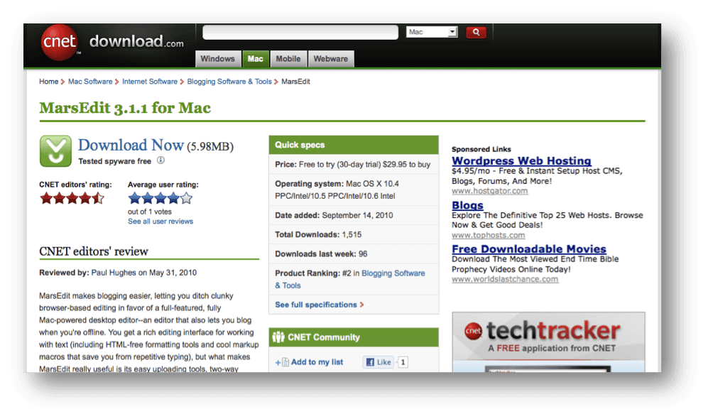
    A great call-to-action does the job of extending those 3 seconds directly towards sale/conversion. If your call-to-action on the page is something like “Go” or “Submit”, then it’s better to have no call-to-action. An abstract call-to-action is a strict no. It’s not just a button; it should be used to explain what’s inside.

See the above design. Call-to-action is the brightest thing on the page, with “Free Download” message and OS requirements.

Just take care of these tips to make the user stay for more or perform an action. Yes, it’s important to follow other tips but the thing above should be on priority to beat the 3 seconds rule.

Beyond 3 seconds

After those 3 seconds, these are the things to take care of to get the user to start the shopping process, know more about the service, or at least stick for more time and come back again.

  • Building trust - After earning some trust in 3 seconds, it’s time to build it by these elements:
    • Testimonials
    • Product features
    • Celeb quotes
    • Social proof
  • Next steps - Now get the user to do more by serving more material to perform next actions towards the sale:
      • How it works
      • Why…
      • Pricing plans

Improving usability should be a primary thing for all website owners before spending in ad campaigns to get more visits. It’s great to generate thousands of ad clicks to the page/website, but even 1% improvement in conversion rate or bounce rate can save a lot of money to buy more visits!

Google Analytics v5 Dashboards

Email Marketing Dashboard

It’s been a long time since we’ve seen the new look of Google Analytics, called “version 5″. There’ve been a lot of changes since it was introduced in Feb 2011.

While working with many different clients, there are some features we liked a lot.

Let’s see these important changes, which eased the way we look at our data in Google Analytics.

“Dashboard” is now “Dashboards”

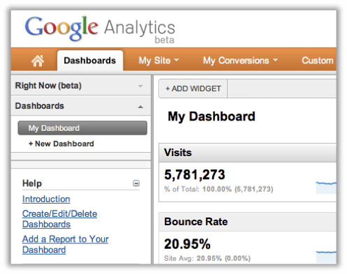
In the new version, we can see “Dashboards” as a tab. We can now have more than one Dashboard in Google Analytics. You’re now allowed to create 20 such dashboards with a maximum of 12 widgets per dashboard. You can easily add/edit/delete widgets.

Widgets
Google Analytics Dashboard Widgets

You can now have 12 widgets per dashboard. Plus, it’s easy now. Previously, to add any widget to your dashboard, you had to go to a particular report, let’s say “Traffic Sources”. You first go to the Traffic sources report and then click on a small “Add to Dashboard” button and it added that widget to your dashboard. Now, just click on “Add widget” in the header of your dashboards, and it provides an easy way to create your fully customizable widget. You can create 4 types of widgets now. Metric, Pie chart, Timeline, and Table.

New fresh look

The ease of use has increased in v5. Here are things we liked a lot,

  • With the new fresh look, the Google team adds a lot of usability to it. Especially, the new dashboard is much more user-friendly than the older one.
  • Add any widget from any of your dashboards.
Add widgets easily
Add widgets easily
  • It’s now more flexible. You can drag and drop your widgets anywhere you want. You can now choose how your dashboard should look.
Google Analytics - Drag and drop widgets
  • Click on the Settings button on any widget to edit/delete it. Very swift!
Google Analytics Visits Widget
  • You can rename your dashboard with a click.
Google Analytics Rename Dashboard
  • The “timeline” which was a default in the dashboard, is not compulsory. The new dashboard is cool! You can customize it the way your want. E.g., create a dashboard with only “Pie charts” of your marketing campaigns or a dashboard with only timelines of your different traffic sources. No mandatory sections, all yours!
Google Analytics Dashboard Timeline
  • The right sidebar is sometimes annoying and takes up unnecessary space. Now you can remove it with one click. Your dashboard is spread on the entire screen, reducing destruction.
Google Analytics Dashboard Righside
Google Analytics Dashboard Overview

Overall, The new Dashboard in Google Analytics 5 is now more smooth, good-looking, and easy to use.

Check out these sample Dashboards we’ve created for Email marketing and PPC campaigns.

Google Analytics Dashboard - Email Marketing

Email Marketing Dashboard

This dashboard shows the performance of the Email campaigns. We’ve added these customized widgets in this dashboard:

Email Visits Shows a number of visits came from mailer campaigns.

Effective landing pages indicate the performance of the landing page with respect to clicks and unique purchases; it’s helpful in deciding which landing page is more effective in mailer campaigns.

Most Visited Countries shows the most visited countries by unique purchases. It’s useful to understand in which geographic location you’re campaign is more successful.

Day on Purchased shows the information on which date users purchased the most, out of people visited by mailers. It helps in analyzing which days are generating more/fewer revenues.

PPC Dashboard

We’ve created this google analytics dashboard for the pay-per-click campaign.

Pay Per Click Dashboard

We’ve added the below Performance indicators (widgets) in the PPC dashboard to measure the effectiveness of the PPC campaign.

Unique purchases by a country shows in which geographic location the campaign is generating the highest revenues. As you can see in the above screenshot, people in the US do most of the purchases. These are the people who click on a PPC ad and buy.

Ad groups with CTR & Clicks indicate the performance of ad groups in terms of how many clicks and CTRs are generated by ad those groups.

Campaign with the clicks & revenue gives the performance of the campaign in terms of clicks and revenue.

CPC vs. RPC is a timeline showing a comparison between cost per click and revenue per click.

Benefits of creating customized Dashboards

1 ) Google Analytics Dashboards are very useful and handy for marketers, let’s say you’ve created 4 to 5 different kinds of dashboards to measure the performance of marketing campaigns. It will help you to get an idea about the performance of your marketing campaigns without looking much into detailed data.

2) Google Analytics Dashboards now have a more powerful graphical representation that can be easily understood by the top management team or by any non-technical person.

With this, we’d love to know from you how you are taking advantage of this cool and completely customizable dashboard. Please share your experiences in the comments.

Page not found. How important is this page for user engagement?

Not found

Not found

Wait, you are on the right page. This post is about “Page not found!”, is the message you get while accessing a non-existing page on a website. It happens when users try to access a page other than a home page, where the main Domain URL is correct(www.mysite.com) but, there’s something after “/” wrong. e.g., www.mysite.com/profilehgjd. Possibilities are,

-       They click on a broken link. www.mysite.com/profi…

-       They make mistakes while typing a long URL manually in hurry for a coffee date. www.mysite.com/profil/sam

-       They goof up while copy pasting a URL. Original: www.mysite.com/abc Copied: tatvic.com/a

Showing a user a default page like above is like telling him, “You are a loser and you don’t deserve to be on my site”

Users are most likely to close the window they find the boring “404 Not found message”. However, no one would want to let the user go. While discovering good error pages, we bumped into some interesting error pages. Here’s how some well known site engage.

1.     Apple: Site map - not the ditto, but all product links

Apple

At Apple, where all products are very popular among all kind of audience, you can’t guess what is someone looking for. So Apple shows important links for all products.

2.     Cleartrip: Redirect to Home page

Cleartrip

Example of a very smart Indian site, Cleartrip.com. After showing this message, it redirects to the Home page in a few seconds. Not bad!

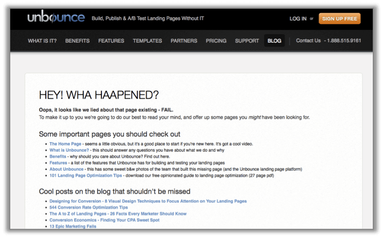
3.     Unbounce: Resources - Some important links and latest Blog posts

Unbounce

Many a times, new users will land on a non-existing page. Talking about what they can do on the site and showing them latest blog posts is a nice way to hook users.

4.     Twitter - Search bar

Twitter

Twitter provides you search bar when you get lost. Obviously, nobody will look for “Pricing plans” or “Contact us” on Twitter. If typed something wrong try to search for it.

5.     Firefox - Provide support, try to help

Firefox

Firefox tries to help you. It tells you possible reasons why you got this page and tells you to Email the problem if you want. If nothing, it tells you to go to Home page and try to look for what you wanted.

6.     Elance - Funny hook

Elance

This is what I call a very nice attempt. A funny and unique hook always stays remembered and users read it for sure.

You might have seen something better or already using something like this. Please share it with us. We’ll use it in our new Website will mention your help here.

Testing Landing Pages, The best way to increase Conversion rate

cnet
Are you testing your landing pages? It’s the best way to increase conversion rate and understand user behavior. This post takes on basics of A/B testing. After reading, you can contact us for a Free A/B Test campaign.

Is your Landing page really doing good? can it be better?

You must have heard someone saying, “wow, that’s an awesome Landing Page.” How awesome? Are you sure that the conversion rate you are getting on your current Landing page is the best? Are you carrying any A/B testing on  it? No? Then I doubt how do you say that.

On Internet, the same user changes his behavior from one web site to other. I might look for girls on Facebook with the purpose of dating, but i won’t do that on Linked in. I’ll become a serious guy in the latter, even if the same girl is there on both the sites. You can either change your site according to the user behavior or change the user behavior as per your site. The latter is very challenging but gives rewards.

e.g. On facebook, every 15 days you see a change, may be profile updates are changed in to news feeds. you don’t question it and change the way you surf facebook and remember it next time. ofcourse the changes are made keeping user in mind, but they tend you to change your behavior.

e.g. while on gmail, they knew that people have a lot of junk mails which don’t go to Spam folder, so they introduced Priority Inbox.

In both the cases, users are happy. It depends on which way you want to chose.

Any way you chose, but to see whether users are behaving the way you want them to, you’ve got to test your pages. Test your pages with variations.

How it  works?

in A/B tests, 2 versions of the same page are tested among 2 groups of users at the same time. All your users are split in two on random basis and are served the page they are selected to see. When they perform an action and land on a conversion page, it forms a conversion. It’s necessary to have only one conversion page for all version you are testing. A conversion page is normally a Thank you page for authenticating the action just performed. A conversion here can be just a click, or download, or a form fill.

How many pages can I execute A/B test at once?

Test 2 pages or 10, up to you. The thumb rule is  “the lesser pages you test, the quicker results you get”. Sites with huge traffic might see results in a few days.


These are the variations you should test:


Call to actions


Free download

Call to action can be a Text or a Button. Anything that tells a user to do something is a call to action. These are the things you should test in call to actions:

- Text - Test text variations.

e.g., “Buy now” vs “Add to cart”, “Free Download” vs “Get it free”, “Fill up this form” vs “Register here”

- Buttons colors

Some colors attract users more. But it depends on the background to foreground combination. Also depends on the Target Audience. Red button on a Travel site might not do well. But it might do great on a Music site.

e.g, red vs yellow

- Buttons and text - See if Buttons or Text is performing better.

A/B Testing for Sign up Forms

A/B Testing - Twitter

Form is the second most important thing on a Landing Page. It gets you more Form fills just a small change.
- Position - Change the position. Test Left vs Right, Horizontal vs vertical.

- Split - If you have a long form, Try splitting a log form in to 2-3 steps and justify each step. Then test Normal vs Split.

- Size - Drop some fields you think are not so important and can keep users from filling in. Try removing any “not so important fields”. Test Long vs Short.

A/B Testing for Header text

A/B Testing Sharekhan

Header does a very good job grabbing users attention. Always keep the header simple, descriptive and as short as possible.

Test different text in the header. e.g. “Great deals on Movie tickets” vs “Cheapest movie tickets in town”, “Great articles on Google analytics” vs “Google analytics at its best”

A/B Tests for Images / Banners

A/B Tests - Jet

Images are very easy to engage users. Sometimes, it helps convert more with a minor change in communication or call to action.

- Image size - it might happen that a smaller image with some breathing space might increase clicks by a good number. Sometimes, a bigger image can bring more users. Test sizes.

e.g., Small vs Big, Horizontal vs Vertical,

- Communication / Call to action - The call to action can be tested same as described above. The communication can be tested for variations of influential lines.

e.g., “Tack visits easily” vs “The best way to track visits”, “Great shirts at great prices” vs “Best deals on shirts in town”

It’s not necessary to test all the features of an object. Test one at a time. For testing features of call to action, test Text first, then test Button colors, and then Buttons and Text.

What types of Pages can be tested?

Any page where some action from the user is required. Here are examples:

Download page

cnet

A download page for software, articles, books, videos or photos.

What content to executing A/B test on :

Call to actions

Position of the button

Images if any. if there’s no image, try putting one.

A/B test on Lead generation page

mailchimp


Sign up page with a form for a website or free trial for a product. Or A lead generation page for a product trial or a bank account.

What to test:

Button

Header of the form, Position and size

Images


Product page

ipod

Page for a particular product display. Or a multiple product page. e.g., A T-shirt or an MP3 player.

What to test:

Button

Call to action

Images

Likewise, there can be many other pages and Variation you can test. But most important, Please test.

A/B Testing Tools

The most widely used tool is Google web optimizer. It’s free. There are other Free and Paid tools available, but when Google does the best job, why go anywhere else. However, for paid tools you can learn our review on new A/b Test tools.

We at tatvic are specialized in Conversion rate optimization projects and A/B test is our love. And to spread the love, we are offering 3 FREE A/B tests a month. You can be the lucky one to grab one. Doesn’t matter even if you test your pages, there’s no harm in trying for free. If you have never test your pages, then you have no right to wait,

Register for a FREE A/B test now!


Happy Testing!

Bot Icon
Bot Icon

Tatvic Bot

Explore About Tatvic and Services