E-commerce Conversion Rate Optimization (CRO) is the process where the goal is to enhance any e-commerce website’s performance by turning more visitors to customers. The primary goal here is to identify various elements of a website to improve its effectiveness and drive more sales.
Here are 14 actionable tips for optimizing the conversion rate of an eCommerce website:
1. A/B Testing:
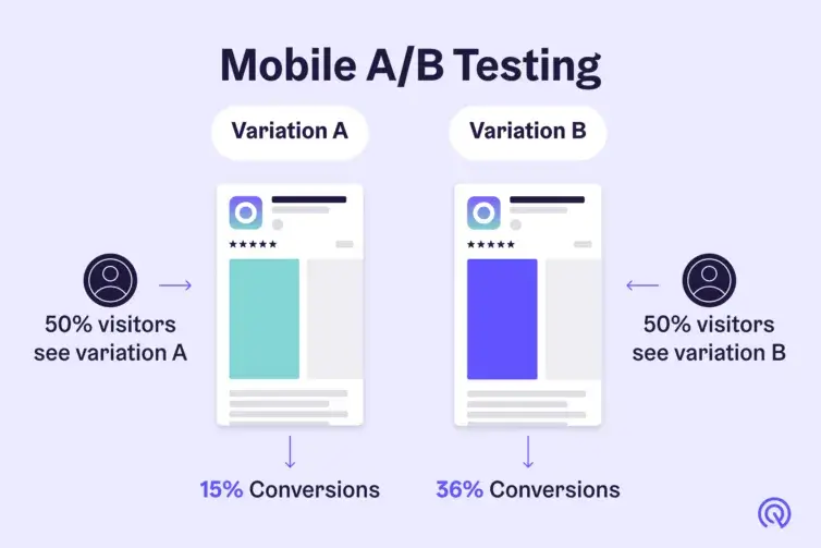
A/B testing is very important for every e-commerce website. Using this approach we can improve the effectiveness of a website in terms of increasing conversion rate and decreasing cart abandonment. For e-commerce websites, A/B testing involves creating two or more versions of a webpage or a part of the web page. Each of these variations will have distinct elements like images, CTAs, headings, or even overall layout. The traffic coming to this particular web page is randomly split equally among these variations and the user interactions are observed.
By analyzing interactions like CTR, form submission, subscription, purchase, sign-up, etc. we can get valuable insights on which design or content resonates best with our users and has a significant impact on the conversion rate. With A/B testing, we can make data-informed decisions and continuously evolve making an e-commerce website the best version of itself.
2. User-Friendly Design:
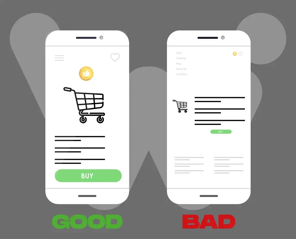
This involves creating a smooth and intuitive shopping experience and maximizing the number of users turning into customers. We can be clear and concise navigation with an easy-to-find menu structure and a prominent search bar. Creating a responsive design has a great impact on user experience as the website content adjusts itself to the display size of the device and mobile has 66% of overall digital traffic comes from mobile.
We can also make the checkout process smoother by reducing the number of steps. An attractive accessible design with a key focus on CTAs also plays an important role as it guides the user for the next action to be taken. These elements collectively enhance customer experience, and user engagement and contribute to the overall success of an e-commerce website.
3. Clear Call-to-Action (CTA):
A clear and concise CTA design that guides users towards taking desired action is crucial for an e-commerce website that strives to be successful. The key here is having a strategically placed CTA with compelling attention-grabbing color and persuasive action-oriented copy. If needed we can also create a sense of urgency or highlight incentives that can further motivate users to act swiftly but surely.
The CTA must be placed where it is easily accessible for a seamless checkout process and we must also ensure that user encounters them when they are motivated enough to take the desired action, which in this case can either be checked out or add the product to the cart. A/B testing with different CTA copy and designs can help us identify the most effective version that resonates with our audience. Regular testing and analyzing user behavior can also help in refining the CTA design with evolving user preferences increasing the impact of CRO.
4. High-Quality Product Images:
Having high-quality product images acts as a visual gateway influencing user perception and purchasing decisions. These images must be compelling and show products from multiple angles with accurate sizes, colors, and textures. Adding zoom functionality will also allow users to get a closer look at the products. Keeping the images consistent throughout the website will maintain visual aesthetics and increase brand trust. Adding lifestyle images creates an emotional connection with users’ minds.
A/B testing with different variations can help identify which styles resonate most with our target audience. High-quality product images play a vital role in driving user engagement, building trust, and ultimately improving conversion rate.
5. Detailed Product Descriptions:
Providing comprehensive details could influence the purchase decisions of potential customers.
It should be clear, and concise, help in making informed decisions, and be easy to understand. Adding bullet points and formatting descriptions properly may enhance readability. We can also incorporate images and videos in the description to make it less boring. Adding some sort of social proof can also encourage users to purchase the product.
Through continuous testing and analysis, we can refine the product description and optimize it for conversion. The placement, visuals, structure, and copy of the description can significantly contribute to the overall success of the website which can be refined by continuous testing and improvement based on the results of the test conducted.
6. Optimized Checkout Process:
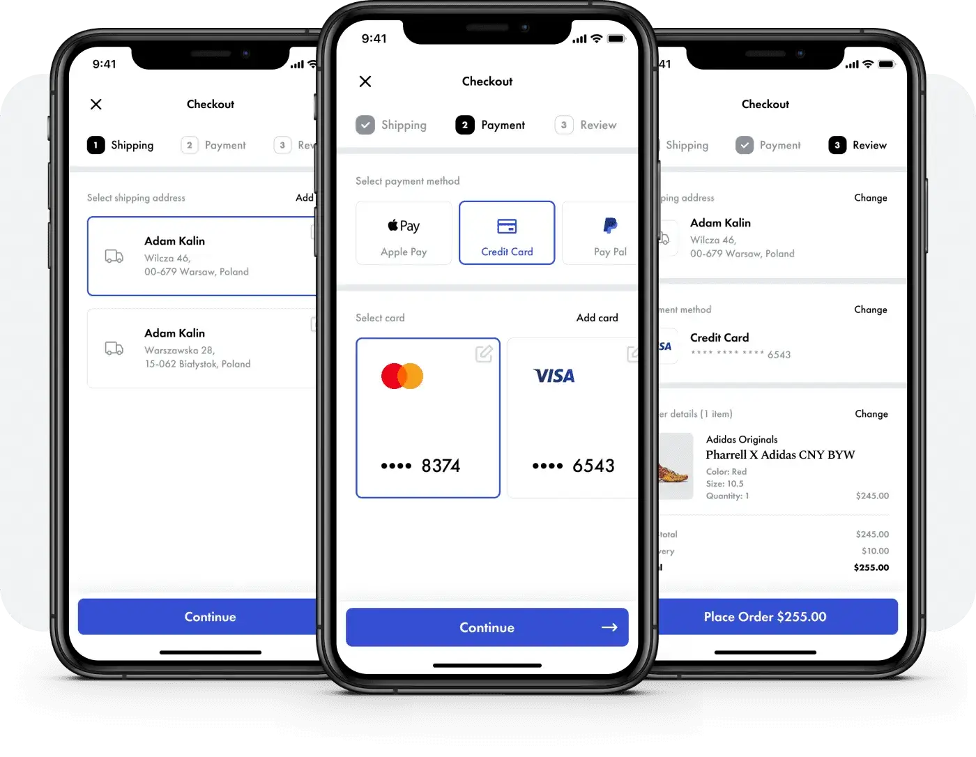
Having an optimized and streamlined journey from product selection to purchase is a critical component of CRO. This process involves minimizing friction and encouraging users to convert. These steps must have minimal distraction and should be user-friendly and visually indicated
Adding a progress bar, offering guest checkout, autofill in forms, trust elements and multiple payment options instill confidence and convenience, and at the same time help to eliminate hurdles and reduce abandonment rates.
Regular testing and analysis can be conducted for testing various sections of the checkout process will allow us to continuously refine based on data of user behavior and feedback. Optimizing the checkout process contributes to significantly reducing cart abandonment rates and ultimately enhancing the success of E-commerce CRO.
7. Trust-Building Elements:
We can establish credibility and foster confidence among our users by adding trust-building elements. These can be in the form of security badges, customer reviews, testimonials, and compliance to data secrecy. Along with social proof, these show our commitment to protecting our customers’ personal and payment information. Being transparent about shipping, returns, and refund policy also leads to a trustworthy shopping experience leaving a positive impact on customers and helps in purchase decision-making. Having clear contact details along with dedicated customer support shows our commitment to accessibility, responsiveness, and the brand’s willingness to serve customers better.
By continuous optimization, of these trust-building elements based on user feedback, we can sustain and enhance customers’ trust for the long term.
8. Personalization:
Personalization refers to providing a tailor-made online shopping experience for individual users and providing them with relevant and engaging content to increase the likelihood of purchase. Personalization is showing product recommendations based on browsing history, past purchases, demographics, user behavior, preferences, and interactions. It also includes dynamically presenting content and promotions. In some cases, personalized landing pages, email campaigns, and on-site messaging are used to create a sense of individual attention and develop a connection between the user and the brand.
Continuously testing using personalized greetings and targeted promotion helps in refining our personalization strategy based on insights that we get from qualitative and quantitative analysis.
9. Exit-Intent Popups:
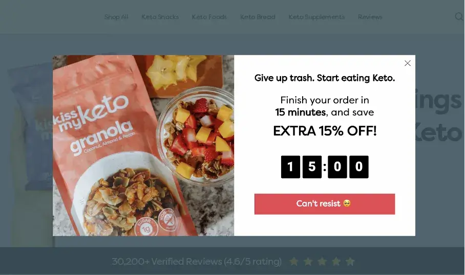
We use Exit-intent popups to target users who are either inactive or about to leave a website without completing the purchase. These pop-ups are typically triggered when the cursor is moved towards the browser’s close button. A wisely designed exit-intent popup can effectively reengage users and reduce cart abandonment. A well-crafted exit-intent popup is timed properly and aligns with the overall branding and messaging of the website.
For best results, it is advisable to A/B test different pop-up designs, versions of copy, and discounts if any. Analyzing the results will give us a deep dive into users’ behavior and help us refine our strategy, ensuring it will help in retaining potential customers.
10. Shipping Information:
Shipping information does influence potential customers’ decision-making. Clear and transparent communication about shipping details is vital for building trust and reducing cart abandonment. Providing information like shipping cost, delivery date, returns, and exchange policies helps manage user expectations. It is recommended to prominently display free shipping if provided. Adding CTAs for tracking or estimated delivery times also helps in improving customer trust.
Various placements and formats of this information on different pages can be tested to find the optimum balance that can help eliminate uncertainties and reduce friction in the buying process.
11. Limited-Time Offers:
Having limited-time offers on an e-commerce website creates a sense of urgency incentivizing immediate action from potential customers. These time-sensitive sales or promotions trigger a fear of missing out (FOMO) driving a quicker decision-making process.
These offers must be prominently displayed on a website and product description page (PDP) to capture more and more attention of visitors and encourage them to purchase before the offer expires. This method taps into the psychological aspect of consumer behavior and may significantly boost conversion.
Conducting A/B tests with different variations and analyzing responses will allow us to fine-tune our business approach by optimizing the effectiveness of these time-sensitive incentives for increased sales.
12. Upselling and Cross-Selling:
This is one of the most powerful strategies that focus on improving average order value (AOV) and maximizing revenue from each customer.
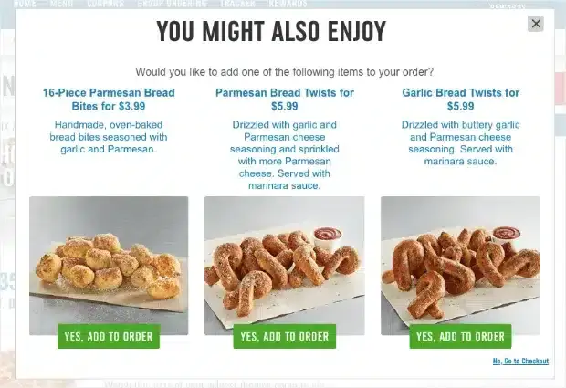
This method involves encouraging customers to purchase a higher-priced or upgraded version of the product that they are considering buying. This can be done by highlighting premium features, bundling related products, or showing “People also bought” products. For instance, suggesting a phone case or charger when a customer is purchasing a smartphone.
Leveraging analytics to understand customer preferences and behavior to tailor these suggestions will enhance the overall shopping experience. It is recommended to test these with different layouts, designs, copy, and placements to get the best results out of this strategy.
13. Social Proof:
It is a powerful psychological phenomenon that builds trust and credibility and at the same time also influences purchase decisions. Here we showcase evidence of the positive experience of other customers who bought the same product. This evidence can be in the form of reviews, testimonials, star ratings, and, photos or videos uploaded by customers.
The purchase decision of most customers is based on social proof as it validates the quality and reliability of the product. Additionally, showing positive reviews or testimonials on PDP instills confidence in potential customers, addressing concerns and uncertainties. We can also use real-life images of customers using products to add a sense of authenticity and reliability to the brand.
Testing different placements and designs for social proof on the home page, category pages, PDP, and different pages of checkout flow can positively influence customers’ perception which will ultimately reduce drop-offs increasing orders placed.z
14. Optimized Product Pages:
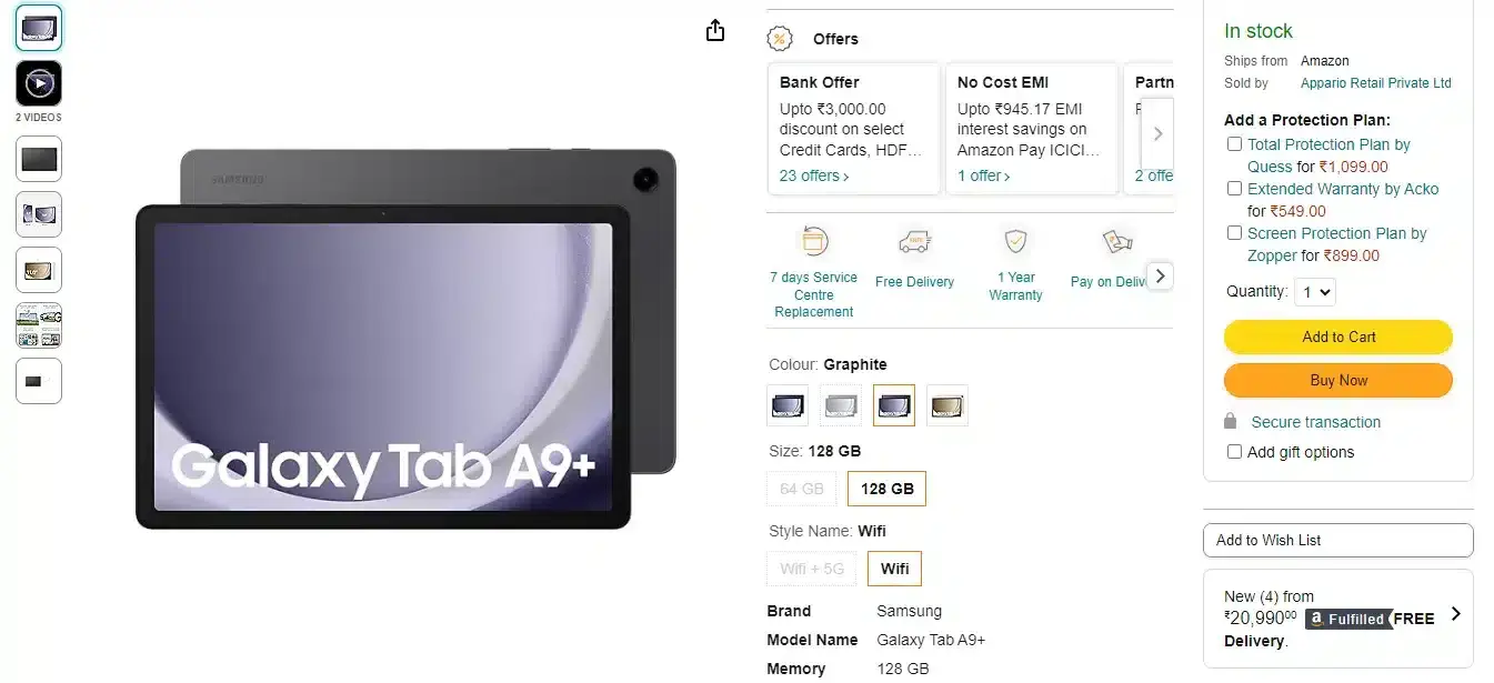
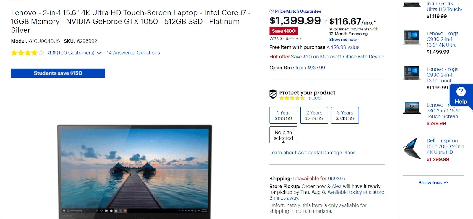
Optimized product pages provide a compelling and seamless experience encouraging visitors to make a purchase. These pages can be meticulously crafted to showcase products effectively by use of high-quality images that highlight key features, simple product descriptions written in persuasive language with all the essential information, and addressing potential concerns with emphasis on unique selling points (USPs). Strategically placing pricing, CTA, bullet points, and clear heading enhance readability facilitating a smoother transition to the checkout process.
Before making any drastic changes to product pages, we must make these changes one at a time and test their effectiveness in driving checkouts. Regular testing and analysis of various elements, imagery, layout, and product details allows us incremental improvements based on user behavior and feedback. Continuous refinement will significantly increase conversion rates and get the best out of our CRO efforts.
Conclusion
Always remember to iteratively improve the website, monitor the impact of these changes, and adapt your strategy based on customer behavior and experience. A data-driven approach is imperative for the success of CRO and getting the most out of these efforts.

