What’s this 3 seconds rule for web?
Just Google it and you’ll get plenty of blog posts about it.
Basically, it matches with the 5 seconds rule for food. The way a dropped food is considered stale after 5 seconds, it happens for a new user on any website. Studies say that a new user spends only 3 seconds on a site to find what he wants, and hops on to another. Obviously no site wants to be the one. You can achieve this by improving usability of your page/website.
From Google, you’ll get a lot of tips for achieving this. But it’s important to know the methodology to get the page ready for 3 seconds rule. I will get in to why these tips are important and good practices for them.
Speed, the first and the best
There’s no reason why a new user will stay on a page if it takes beyond 3 seconds to load. You’ve got just 3, the more you save, the more convincing you can do. Improving usability is not limited to changing the design. While designing or re-designing, make sure that your page is on diet!
Focus on the first fold, it can make it, or break it!
The user will make his first decision to stay on the site by seeing whatever he can on his screen without scrolling down. The first fold is the only place to justify those 3 seconds. Other things work to keep the user on the page for more time towards the sale or conversion.
In the first fold:
Now, let’s talk about things to take care of in the first fold.
-
Pleasant design
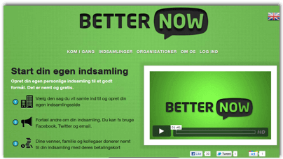
After landing on the page, looks is the first thing to create interest. Visuals talk better than words. A cool looking and (especially) working design builds a trust in user’s mind that there’s a good company behind this website. Would you buy a Rolex watch from a hawker? Vibrant colors, big fonts, neat & clean layout, and optimum usage of white space are things to take care of while designing. Here’s a design I liked while surfing randomly today:
What’s in it for me factor
This question is there in every user’s mind from the moment he gets on a page. This question can be answered via many elements. e.g., tagline, headline, main communication, an enticing banner or just a logo, or by all of them. The list is below:
- Clear messaging
- Prominent logo – The company logo is the identity. It has to be the first thing to be seen on the page. A well-designed and prominent logo tells a story.
- Simple and crisp tagline – Sometimes, an intuitive tagline is enough to keep the user glued for more stuff. Check this tagline from Zendesk. The moment you land on the page and locate the logo, you see the purpose of the website right there.
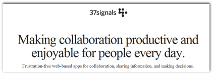
- Easy to understand headline – Headlines are great things to extend the tagline. Sometimes, it does the job of tagline as well. It can be a one-liner, or max. 2. 37signals does this job perfectly. It doesn’t need the tagline with this communication:
-
Main communication
This element communicates website’s business. This can either be the headline itself, or a good looking banner with 2-3 lines.
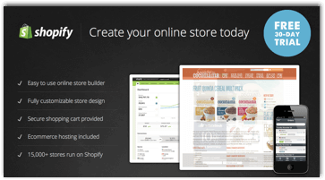
Checkout a clear headline which works as tagline/headline/what’s in it for me factor.
-
What does it offer
You can either talk about the benefits first as the what’s in it for me factor, then explain product features, or directly explain the product as what’s in it for me factor.
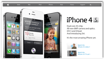
The page for iPhone communicates both points 4 & 5 above together, smartly with big product images. The product has such strong features, that it’s enough to get clicks.
-
Call to action
A great call-to-action does the job of extending those 3 seconds directly towards sale/conversion. If your call-to-action on the page is something like “Go” or “Submit”, then it’s better to have no call-to-action. An abstract call-to-action is a strict no. It’s not just a button; it should be used to explain what’s inside.
See the above design. Call-to-action is the brightest thing on the page, with “Free Download” message and OS requirements.
Just take care of these tips to make the user stay for more or perform an action. Yes, it’s important to follow other tips but the thing above should be on priority to beat the 3 seconds rule.
Beyond 3 seconds
After those 3 seconds, these are the things to take care of to get the user to start the shopping process, know more about the service, or at least stick for more time and come back again.
- Building trust – After earning some trust in 3 seconds, it’s time to build it by these elements:
- Testimonials
- Product features
- Celeb quotes
- Social proof
- Next steps – Now get the user to do more by serving more material to perform next actions towards the sale:
-
- How it works
- Why…
- Pricing plans
-
Improving usability should be a primary thing for all website owners before spending in ad campaigns to get more visits. It’s great to generate thousands of ad clicks to the page/website, but even 1% improvement in conversion rate or bounce rate can save a lot of money to buy more visits!


